| COMPANY: | Credit Union (Fundamentals in UX Design CA for IADT) |
| TEAM: | Agnieszka Przygocka, Jill O’Callaghan |
| MY ROLE: | UX Researcher, UX Designer |
| TOOLS: | Google Docs, Google Forms, Figma, Miro, ScreenFlow |
| METHODS: | Heuristic Evaluation, Task Analysis, Usability Testing, Think Aloud, SUS, Paper Prototype |
| TIME: | Nov – Dec 2020 |
This part contains critical appraisal of a digital product in terms of its usability and the user experience it provides based on contemporary usability heuristics and user experience principles.
UNDERSTANDING THE PROBLEM
We were provided with the video demonstrating Counter Program by Wellington-IT. Our first impression was that system is very complex, outdated and impossible to use in an intuitive way.
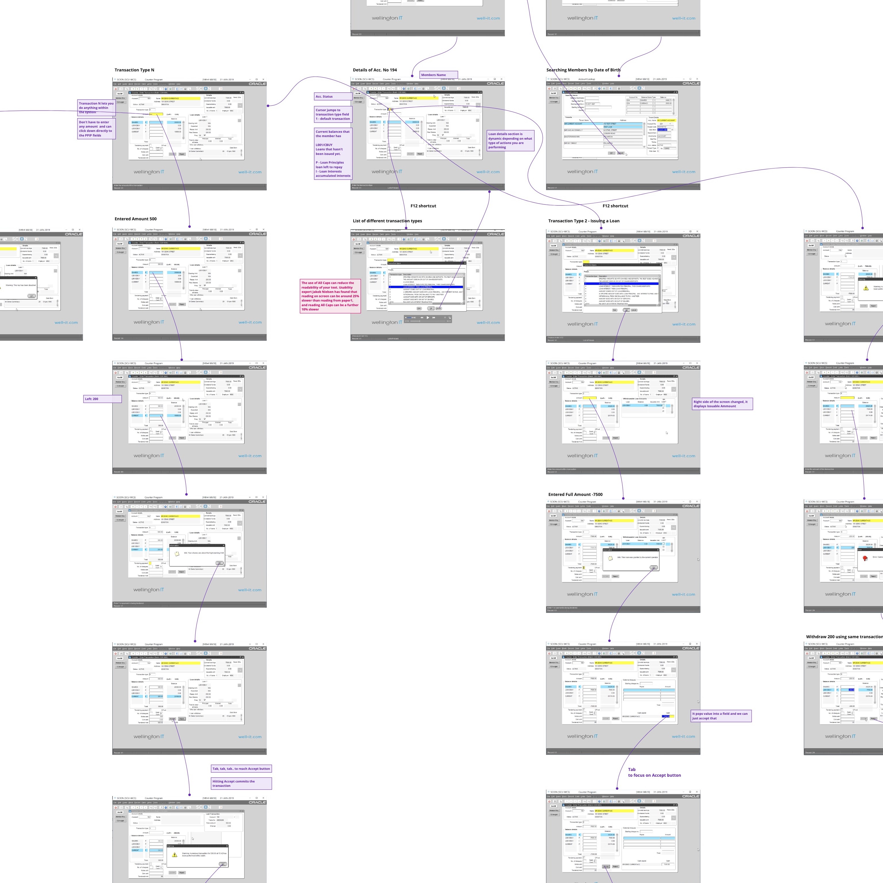
Because of its complexity, we have decided to take screenshots from the video provided and map step by step each of the tasks completed. This gave us a deeper understanding of the current system and helped to decide what methods to use in the next steps.
We have decided to work on this task individually for the learning purpose. Understanding by both of us how the system works was crucial in the next phases of our project.
From the interview with one of the stakeholders, we were able to factor in some of the business goals. The most important was reducing transactions processing time and providing streamlined experience to credit union tellers. It can give credit unions a chance to reduce cost. The onboarding, help within the system, ease of use was also important to our stakeholders and could reduce the cost of training.
COMPETITIVE ANALYSYS
To understand better the industry we have analysed multiple competitors solution for processing the loans, banking applications and even collected slips from TSB to understand how transactions are processed and what type of information is required. We have analysed also indirect competitors looking for interesting solutions and features, like MicroBiz POS.
The competitive analysis helped us to identify the common patterns in the design of enterprise software, dashboards and how some of the operations are processed.
HEURISTIC EVALUATION
After analysing the video it becomes apparent that the current system does not adhere to multiple UX guidelines, accessibility guidelines and doesn’t provide help for the users. There were multiple areas of problems and to identify specific issues we have decided to conduct a heuristic evaluation.
We used the heuristic evaluation process recommended by Euphemia Wong (Wong, 2020).
The most time consuming was to compile a list of relevant heuristics. I was using Nielsen’s 10 Heuristics (1994) as categories for our more specific heuristics.
I chose relevant guidelines from the four main sources:
- Andy Budd’s 9 Heuristics for Modern Web Application Development
- Roman Zadyrako – 5 Heuristics of User Onboarding
- Userfocus – 247 web usability guidelines
The new learning for me was to add accessibility-focused guidelines to the list. Deque webinars were an invaluable source of knowledge on how to assess accessibility during the design phase.
- Deque – A Practical Framework for Evaluating Designs for Accessibility
Because of the limitations of these projects both of us were acting as evaluators. The recommended practice by Euphemia Wong is to recruit four experts to evaluate the system.
We collated the results of our evaluation in a spreadsheet. It was calculated by what percentage the website complies with the guidelines. For each checklist item rating of -1 (doesn’t comply with the guideline), 0 (kind of complies), 1 (complies) was added. If a guideline was not relevant, the field was left blank.
The spreadsheet template we were using was created by me for my past projects. It was a great help when collaborating with my partner who was new to heuristic evaluation. Jill had no problems using it and we completed the task without issues.
The results of the evaluation were summarised in the same spreadsheet. In the Summary Tab, a score for each group of heuristics was calculated. The average score given by each evaluator is quite low, 0-44%. That is the percentage Counter Program conforms to all listed heuristics.
I have collated findings in two lists, positive findings and issues.
Based on these findings, I have mapped solutions and recommendations in the affinity diagram format and we discussed them with my partner Jill. That map was helping us when designing a new solution.
More details and documents on heuristic evaluation can be found in Appendix A – Heuristic Evaluation.
PROCEDURAL TASK ANALYSIS
Initial analysis of the tasks presented in the video gave us a good understanding of what Counter Program is all about. Procedural tasks analysis was our attempt to extract information from or screenshots. Strip it from the outdated UI and focus purely on the functionality. Jill’s experience from the credit union was invaluable. She understands how transactions are handled and were able to analyse tasks in a great depth. She put together the Task Analysis
I later came up with the simplified version, which helped us to stay on track with the design, without the distractions of all unnecessary steps.
With all the complicated menus, we were quite aware that part of the application we are working on is just a small fragment of a bigger system. I thought that understanding how broad and deep is the system could help us with making better design decisions in the next phases.
It was a great learning for me to use the Task Hierarchy method recommended in the “User and Task Analysis for Interface Design” by JoAnn T. Hackos
From the Task Hierarchy, we concluded that we need to design a solution which will be easy to scale, provide navigational components to accommodate more options, design for consistency with components which can be-reused for other application screens.
REFERENCES
- Hackos, J. T., & Redish, J. C. (1998). User and task analysis for interface design. New York, NY: Wiley.
- Heuristics for Modern Web Application Development: January 17, 2007. (n.d.). Retrieved December 14, 2020, from http://www.andybudd.com/archives/2007/01/heuristics_for_modern_web_application_development/
- Nielsen, J. (1994b). Heuristic evaluation. In Nielsen, J., and Mack, R.L. (Eds.), Usability Inspection Methods, John Wiley & Sons, New York, NY.
- Nielsen, J. (1994, April 24). 10 Usability Heuristics for User Interface Design https://www.nngroup.com/articles/ten-usability-heuristics/
- Onboarding.Pro, R. (2017, October 28). 5 Heuristics of User Onboarding. Retrieved December 10, 2020, from https://medium.com/@romanzadyrako/5-heuristics-of-user-onboarding-8c5a91c85139
- Pernice, K. (2018, February 18). Affinity Diagramming: Collaboratively Sort UX Findings & Design Ideas. Retrieved March 15, 2018, from https://www.nngroup.com/articles/affinity-diagram/
- Systems, D. (n.d.). Introduction to Accessibility Heuristics. Retrieved December 14, 2020, from https://accessibility.deque.com/live-webinar-accessibility-heuristics
- Travis, D. (n.d.). Retrieved December 6, 2020, from https://www.userfocus.co.uk/resources/guidelines.html
- Wong, E. (n.d.). Heuristic Evaluation: How to Conduct a Heuristic Evaluation. Retrieved December 14, 2020, from https://www.interaction-design.org/literature/article/heuristic-evaluation-how-to-conduct-a-heuristic-evaluation
- World Leaders in Research-Based User Experience. (n.d.). Affinity Diagramming: Collaboratively Sort UX Findings & Design Ideas. Retrieved December 5, 2020, from https://www.nngroup.com/articles/affinity-diagram/

Part 2 - User Research
Collecting and examining information in order to empathise with users and identify their needs and scenarios of use.

Part 3 - Building Paper Prototype
Designing and constructing a low fidelity prototype of a solution to address a user need by applying principles of design thinking, problem-solving, and critical thinking.

Part 4 - Evaluating Final Solution
Usability testing and heuristic evaluation of the final prototype.


