
| COMPANY: | Credit Union (Fundamentals in UX Design CA for IADT) |
| TEAM: | Agnieszka Przygocka, Jill O’Callaghan |
| MY ROLE: | UX Researcher, UX Designer |
| TOOLS: | Google Docs, Google Forms, Figma, Miro, ScreenFlow |
| METHODS: | Heuristic Evaluation, Task Analysis, Usability Testing, Think Aloud, SUS, Paper Prototype |
| TIME: | Nov – Dec 2020 |
Designing and constructing a low fidelity prototype of a solution to address a user need by applying principles of design thinking, problem-solving, and critical thinking.
INITIAL HAND SKETCHES
With the initial hand sketches, we were brainstorming ideas, exchanging the way we think about the solution to the problem. We were focusing on addressing issues identified with user research, stakeholder interview and heuristic evaluation.
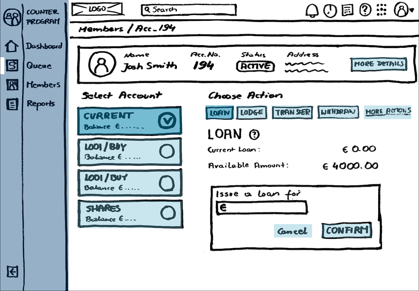
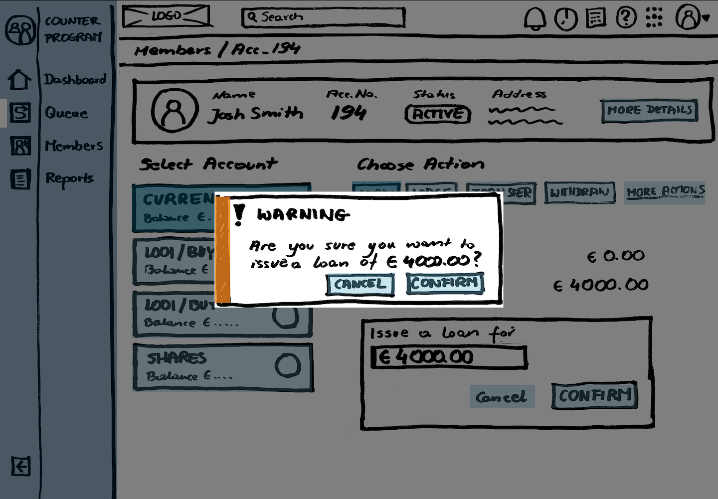
Our focus was tasks of issuing a loan, reversing transaction and lodging cheques along with built-in help features.
INITIAL PROTOTYPES AND TESTING
We have decided to build a paper prototype and make it interactive in Figma. This solution gave us the best of both worlds. We were able to sketch ideas very quickly but also test it and record it without the need for swapping paper pages in front of our participants.
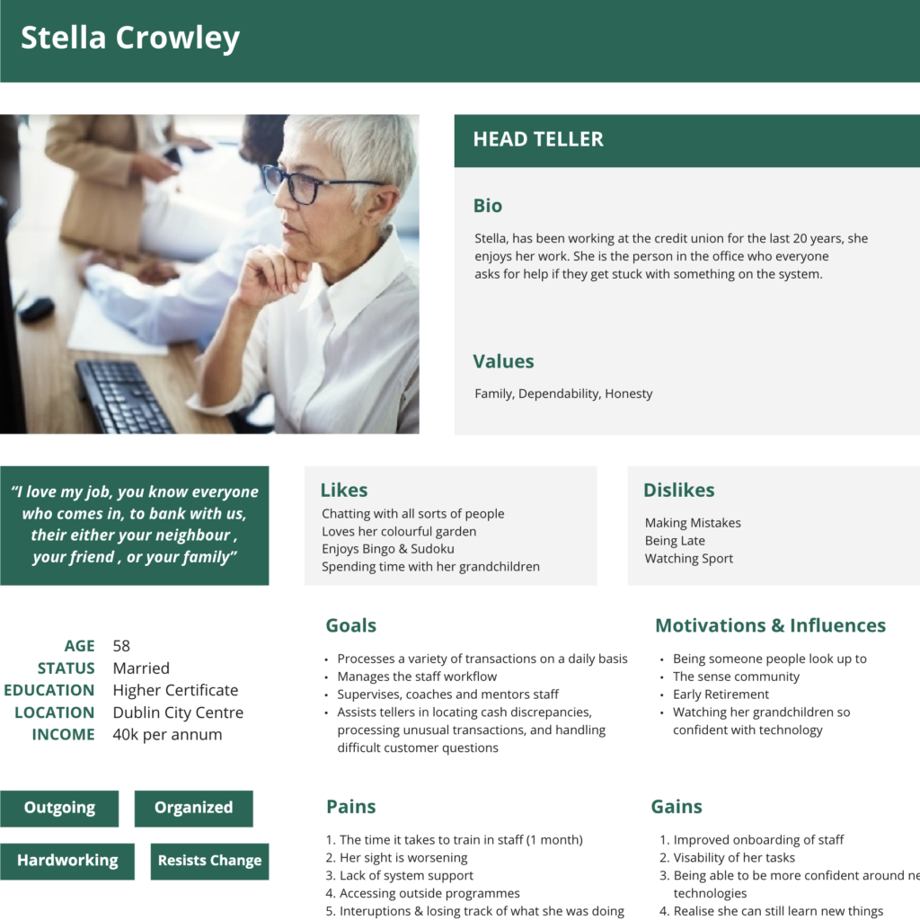
At every stage of our design work, we were asking ourselves, is Stella going to have to click less. Is Andy going to understand how to complete this task without asking anyone?
Jill has built the initial prototype. I gave her a crash course on how to use Figma. According to her feedback, it was a good learning exercise for her. She did a terrific job, and we were ready to go ahead with the first tests. It was the first time for Jill to run usability sessions, so we decided to treat the first round as a training session before our main usability testing of the final solution.
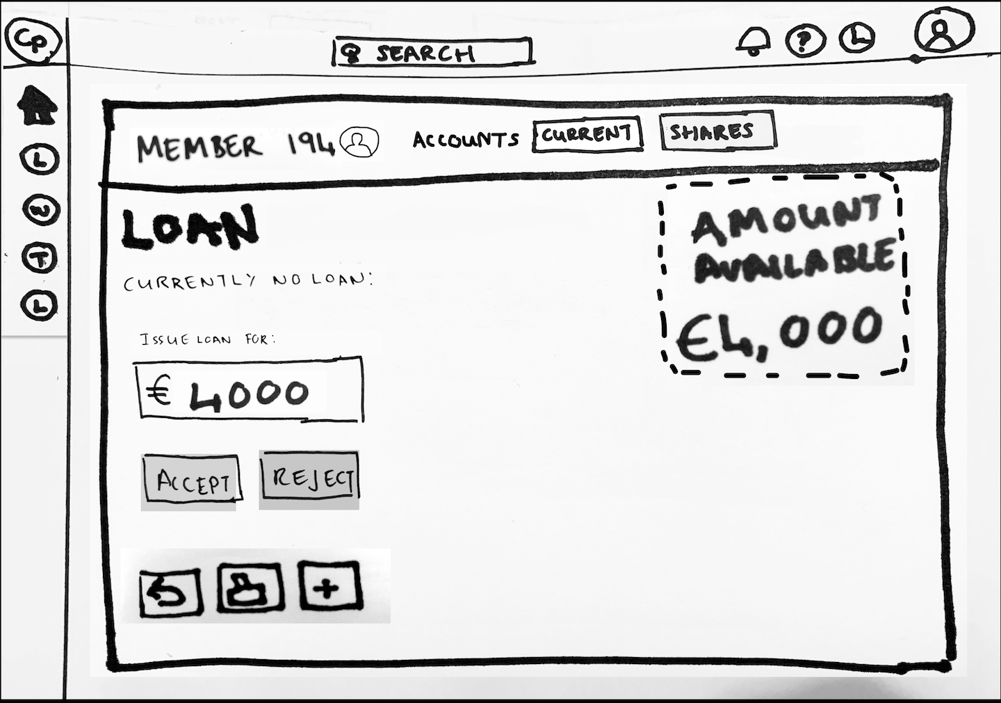
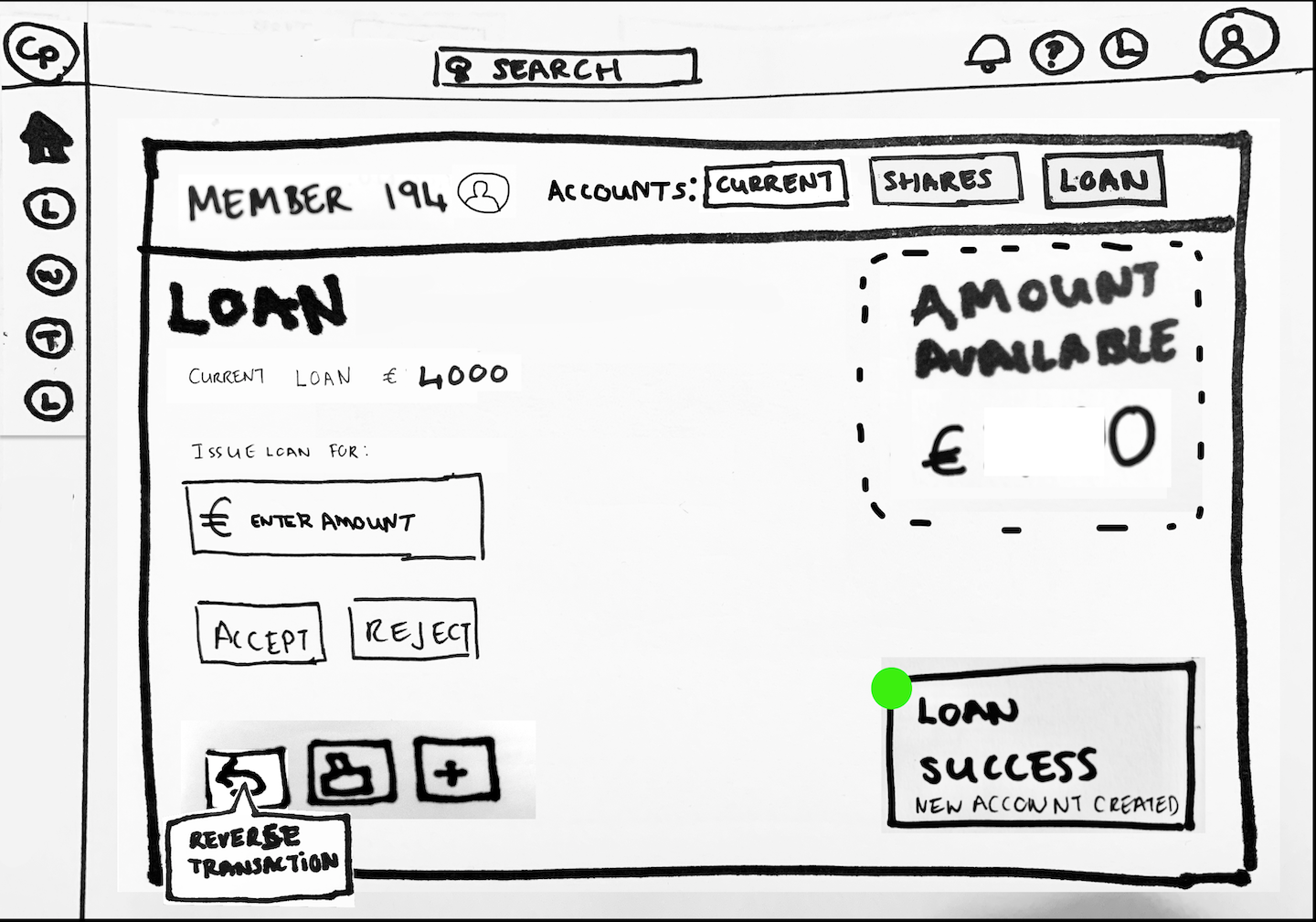
Clickable Figma prototypes can be found here:
This prototype was tested by Jill quickly, without much preparation. We just wanted to find out if the general layout was easy to understand for the users. We received some interesting feedback, and also were able to identify issues, in the prototype itself.
Here are our findings which we addressed in the next iteration.
UPDATING TASKS HIERARCHY
Based on our findings and because of the new idea of adding queuing management, I updated tasks hierarchy. The main goal was to improve application flow. In the initial prototype, we placed actions in the side menu. It didn’t work well for such a complex system, and we had to redesign it. That way, we were able to add to the menu one more level for Queues, Members and leave space for other screens to come.
FINAL PROTOTYPE
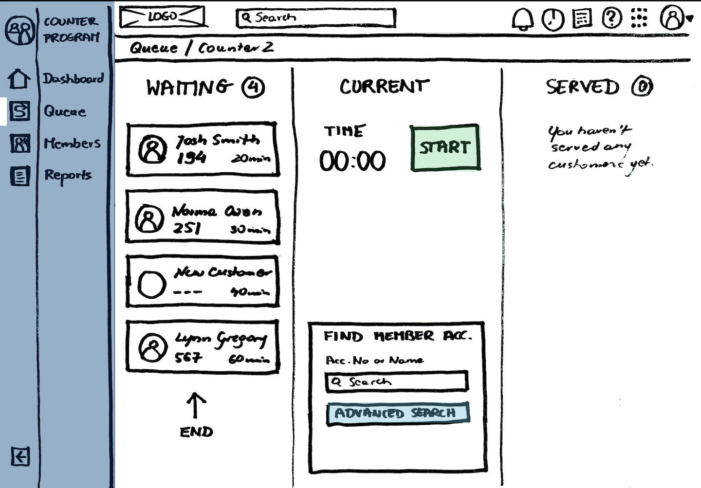
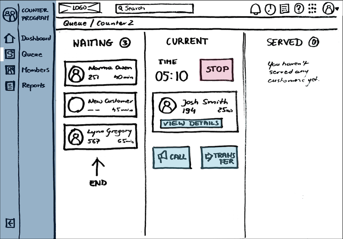
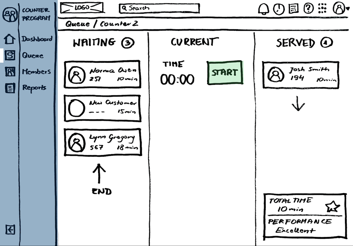
Based on our findings, we decided to extend our final prototype to make processing transactions even smoother. Jill came up with the idea of using biometrics as a check-in method. There was a gap between the member account screen with transaction form and the check-in. We proposed a queuing system to bridge that gap. It allows tellers to load account details without the need for searching. Also, it records the time spent to serve a customer.
During usability testing, some participants were not happy with measuring tellers’ performance. We would have to conduct more research to get that solution right. We aim to design it as a motivational tool rather than a way to control staff members.
DESIGN HIGHLIGHTS:
- Queue management for streamline customer flow and branch operations.
- Tellers rewarded with performance feedback.
- Recording the time spent to serve customers.
- Reduced need to search for a member account – customers check-in with biometrics, and are automatically added to the queue in the system.
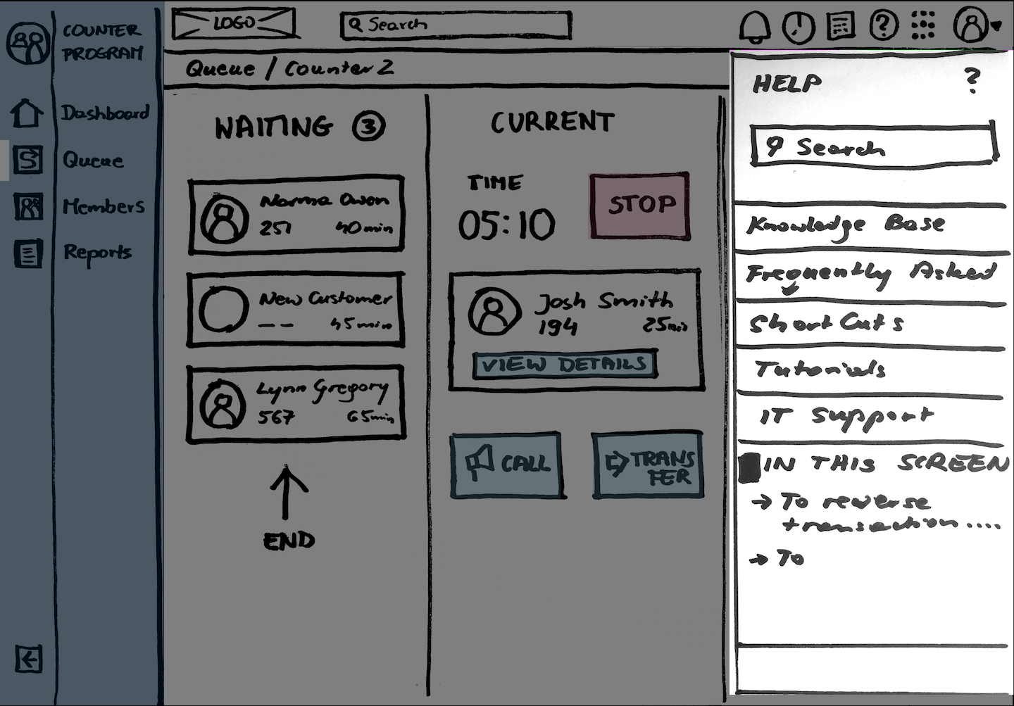
- Help Drawer to improve onboarding and learnability.
- Contextual tips to help tellers navigate through their tasks.
- Clear labels and call to actions.
- More accurate system notifications, easy to understand with next step action buttons.
- Confirmations before dangerous actions.
- Progressive disclosure – showing only features which are needed at the time. Advanced features are hidden as default.
- The global menu which can be easily extended to accommodate more screens
- Breadcrumbs helping users to understand where they are in the system.
- More space between items, visual hierarchy.
- Quicklinks to most common actions – no need to remember the transaction codes.
- Option to customise quick links.
- Global search.
- Modular design – easy to scale and reuse components for other programs to improve consistency and learnability.
- Potential idea – scanning cheques.
CLICKABLE FINAL PROTOTYPE IN FIGMA
REFERENCES
- Nielsen Norman Group. (2014, January 12). Task Scenarios for Usability Testing. Retrieved December 5, 20208, from https://www.nngroup.com/articles/task-scenarios-usability-testing/
- Medero, S., Cheinman, K., McGovern, G., Dauer, J., Bucher, A., & Glushien, N. (2007, January 23). Paper Prototyping. Retrieved December 8, 2020, from https://alistapart.com/article/paperprototyping/
- Preece, J., Sharp, H., & Rogers, Y. (2016). Interaction design: beyond human-computer interaction. Chichester: Wiley.
- Schmidtke, B. (2020, July 23). Prototype on Paper – in Figma. Retrieved December 12, 2020, from https://medium.com/penguin-digital/prototype-on-paper-in-figma-6e91c1aefbd4
- Tubik Studio. (2017, December 01). 3C of Interface Design: Color, Contrast, Content. – UX Planet. Retrieved March 27, 2018, from https://uxplanet.org/3c-of-interface-design-color-contrast-content-235b68fbd9a1
- Design, D. (2020, October 21). What Is Human-Centered Design? Retrieved December 1, 2020, from https://medium.com/dc-design/what-is-human-centered-design-6711c09e2779

Part 4 - Evaluating Final Solution
Usability testing and heuristic evaluation of the final prototype.
Part 1 - Analysis of Existing Solution
Critical appraisal of a digital product in terms of its usability and the user experience it provides based on contemporary usability heuristics and user experience principles.
Part 2 - User and Market Research
Collecting and examining information in order to empathise with users and identify their needs and scenarios of use.


