Heuristic Evaluation + Usability Testing + UX Analysis + Recommendations
THE BRIEF
Tesco is a British multinational grocery and general merchandise retailer. Variety of services is offered on their e-commerce website Tesco.ie, creating value for their customers and earning their loyalty. The success of the website depends on the people who shop with them. Ease of use would increase the number of returning customers. The goal of the company is to ensure that customers are satisfied with the website, they like it and they will shop again.
KEY CHALLENGES
On Tesco.ie, customers can search for recipes and shop ingredients. The path from meal planning to ingredient purchase was disrupted, causing users to drop out of the purchase process before the final checkout. Users had to manually fill their shopping basket with recipe ingredient list. This made a shopping experience time-consuming and frustrating. Seamless integration allowing customers to instantly order recipe ingredients would solve that problem.
The goal is to identify issues and recommend design changes to help users accomplish the task of planning a meal and buying ingredients. A dual-method usability evaluation was used to get insights into interface problems. Usability testing focuses on users journey and type of content, while heuristics review was directed at e-commerce interaction factors and overall user interface factors.
THE SOLUTION
HCI GOALS TO BE EVALUATED
- Identify and prioritise important issues, weaknesses and strengths of the general UI navigation and structure.
- Assess the overall effectiveness and ease of use of the navigational structure on Tesco.ie.
- Determine the strengths and weaknesses of the information displayed on Tesco.ie.
- Identify potential obstacles to find a recipe, buy ingredients, find special offers and use “Multisearch”
- Finding out what features customers use the most or does not use at all.
- Finding out what the customers encountered while navigating the website.
- How satisfied where customers with the ability to get everything that is required to make a quick dinner.
- Make recommendations for how to fix the most severe problems.
PROCESS
HEURISTIC EVALUATION
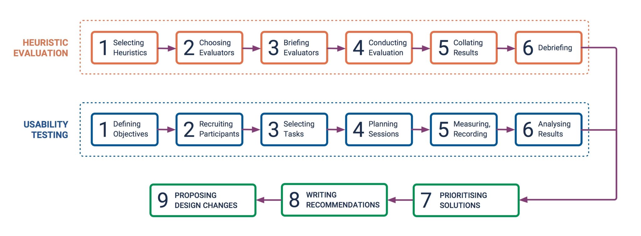
We used the heuristic evaluation process recommended by Euphemia Wong.
1. Selecting Heuristics

2. Choosing Evaluators
Four evaluators were selected. According to (Nielsen & Molich, 1990), 3 to 5 evaluators would be able to detect about two third of the usability problems. All the chosen experts had experience in the web design field and were familiar with the online shop’s operations and patterns.
4. Conducting Evaluation
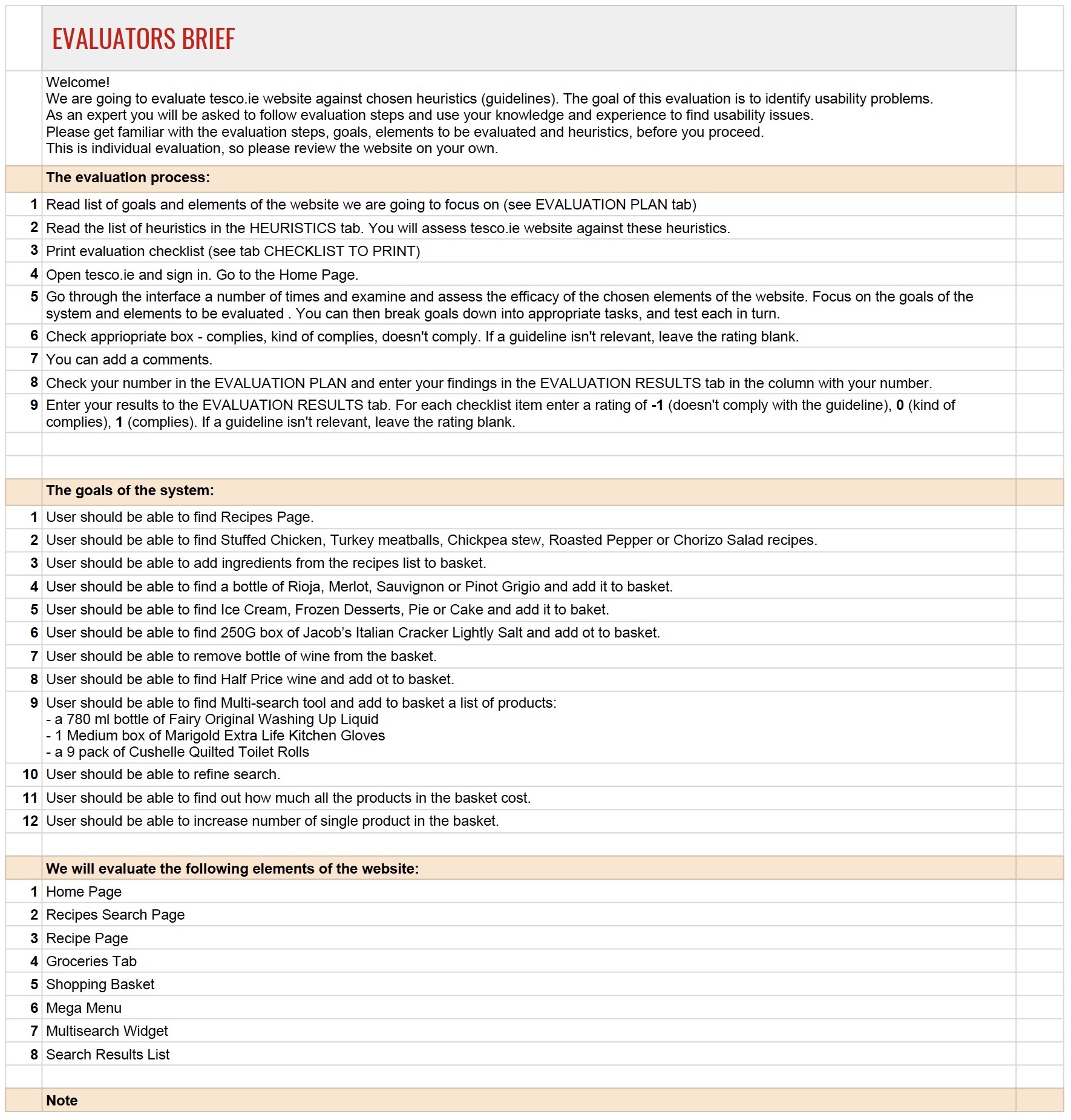
The evaluation was conducted independently by each expert. They went through the interface a number of times and examined the efficacy of the chosen web elements.

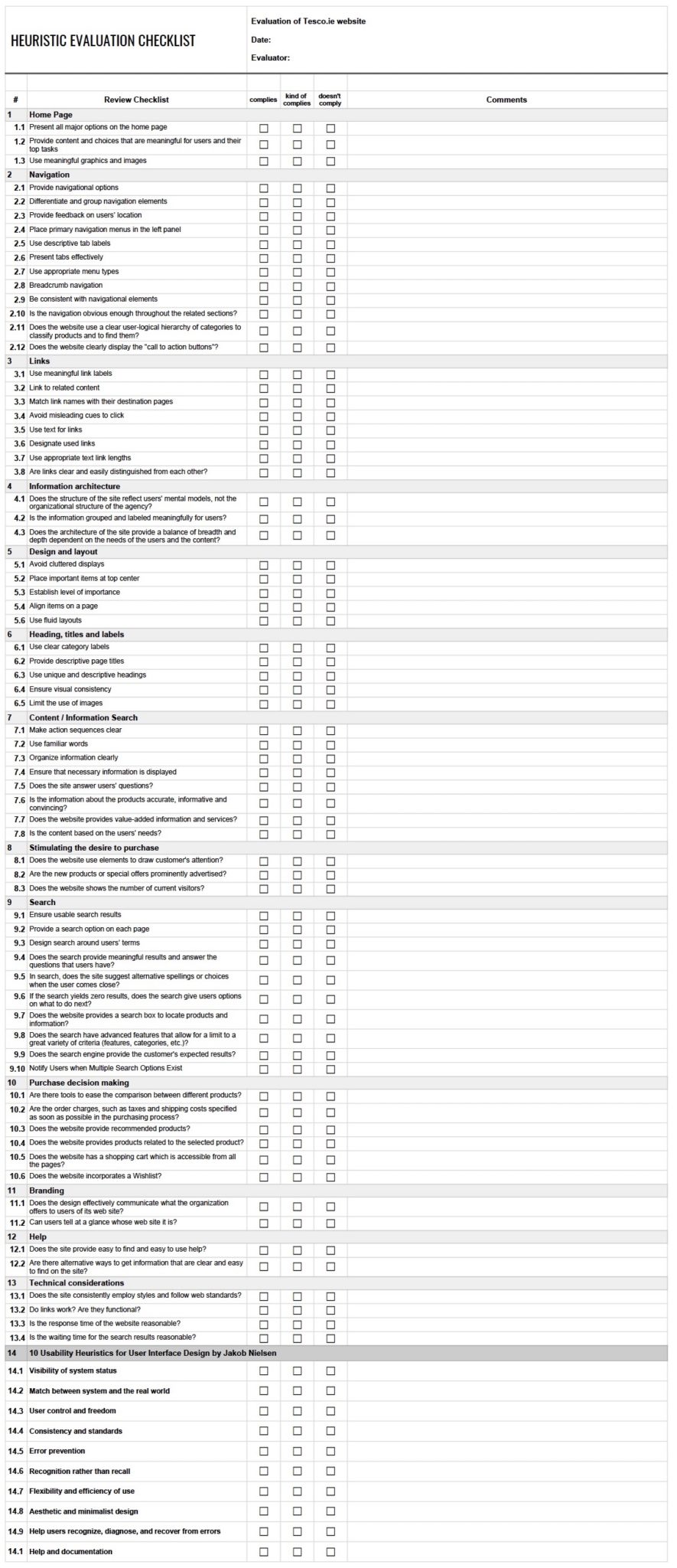
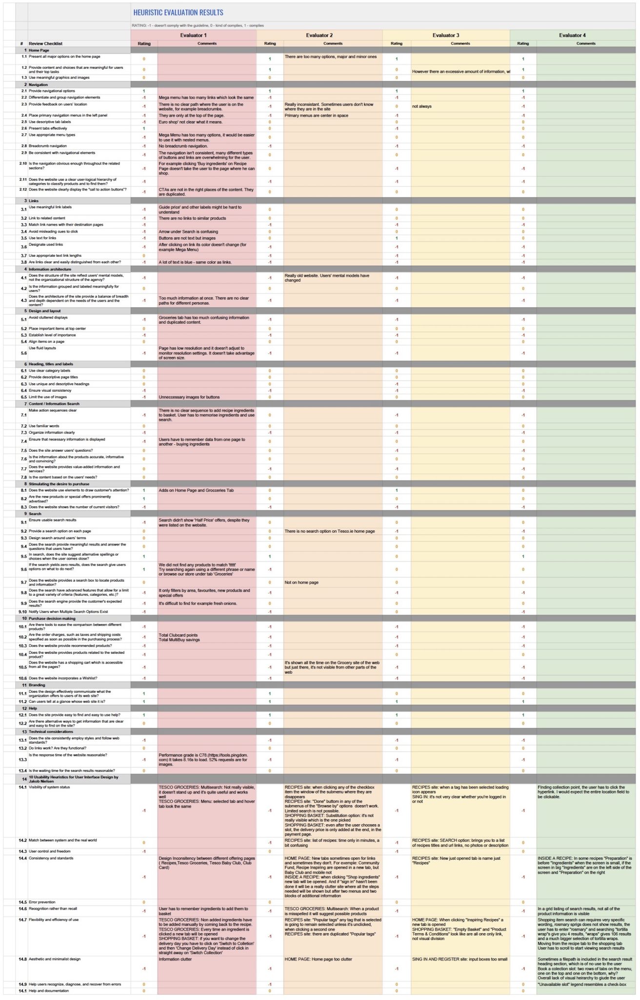
They focused on the goals of the system, using a checklist to note if the website complies with selected guidelines and describe the problem.
5. Collating the Results
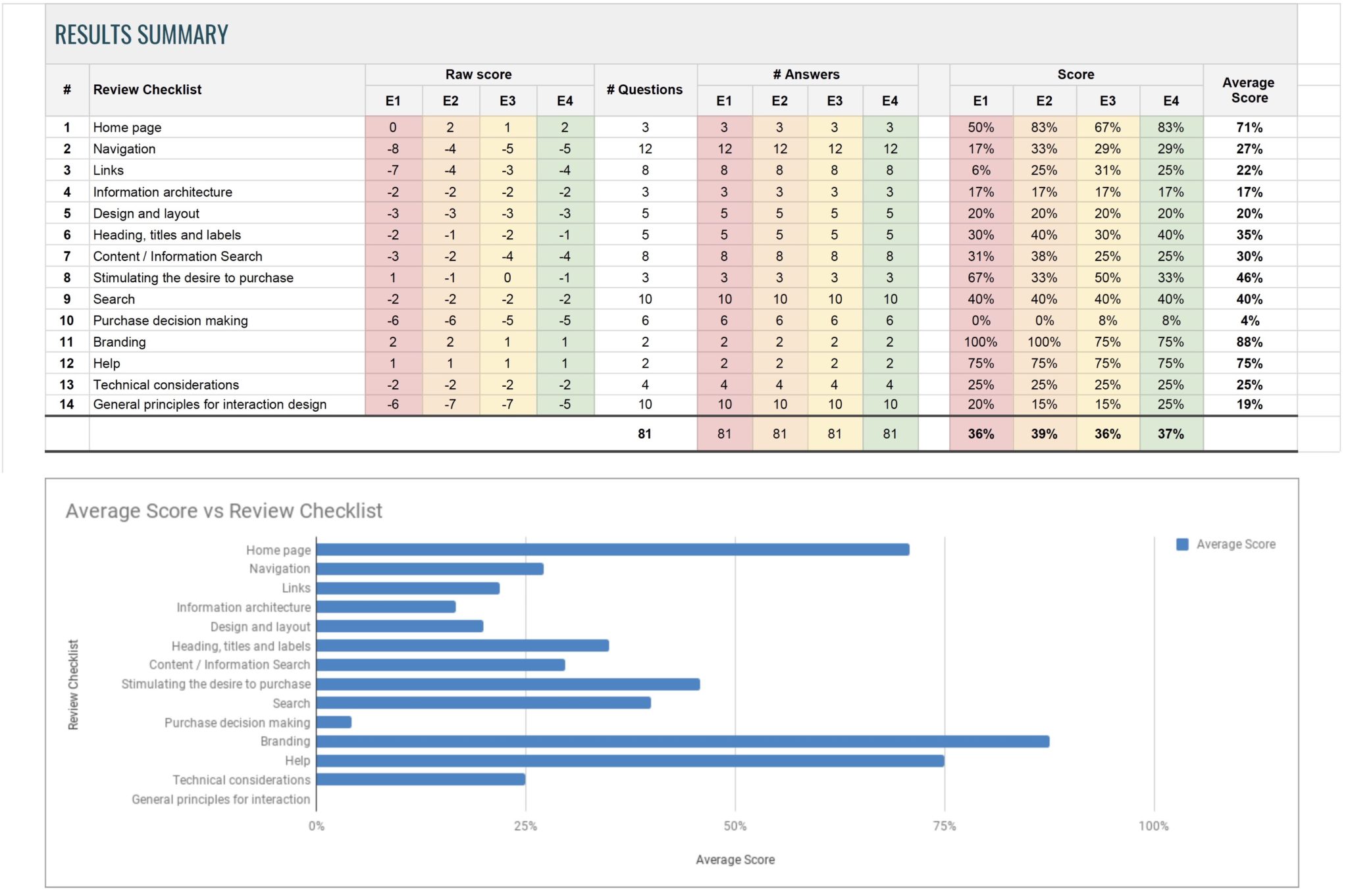
The results from all evaluators were collated in a spreadsheet. It was calculated by what percentage the website complies with the guidelines. For each checklist item rating of -1 (doesn’t comply with the guideline), 0 (kind of complies), 1 (complies) was added. If a guideline was not relevant, the field was left blank.
In the Summary Tab, a score for each group of heuristics was calculated. The average score given by each evaluator is quite low, 36-39%. That is the percentage Tesco.ie conforms to all listed heuristics.
USABILITY TESTING
Usability testing was planned using steps listed by Lewis (2006)
1. Defining Test Objectives
Two types of data were measured: quantitative (time-on-tasks, ability to complete tasks successfully) and qualitative :
- How easily do users understand what is clickable?
- How user navigate to complete tasks?
- How users navigate between different sections and pages?
- How easily and successfully do users find the products or information they are looking for?
- How well do users understand the symbols and icons? Which ones are problematic and Why?
- Where on the site do users go to find Search? Why?
- How easily can users return to the homepage?
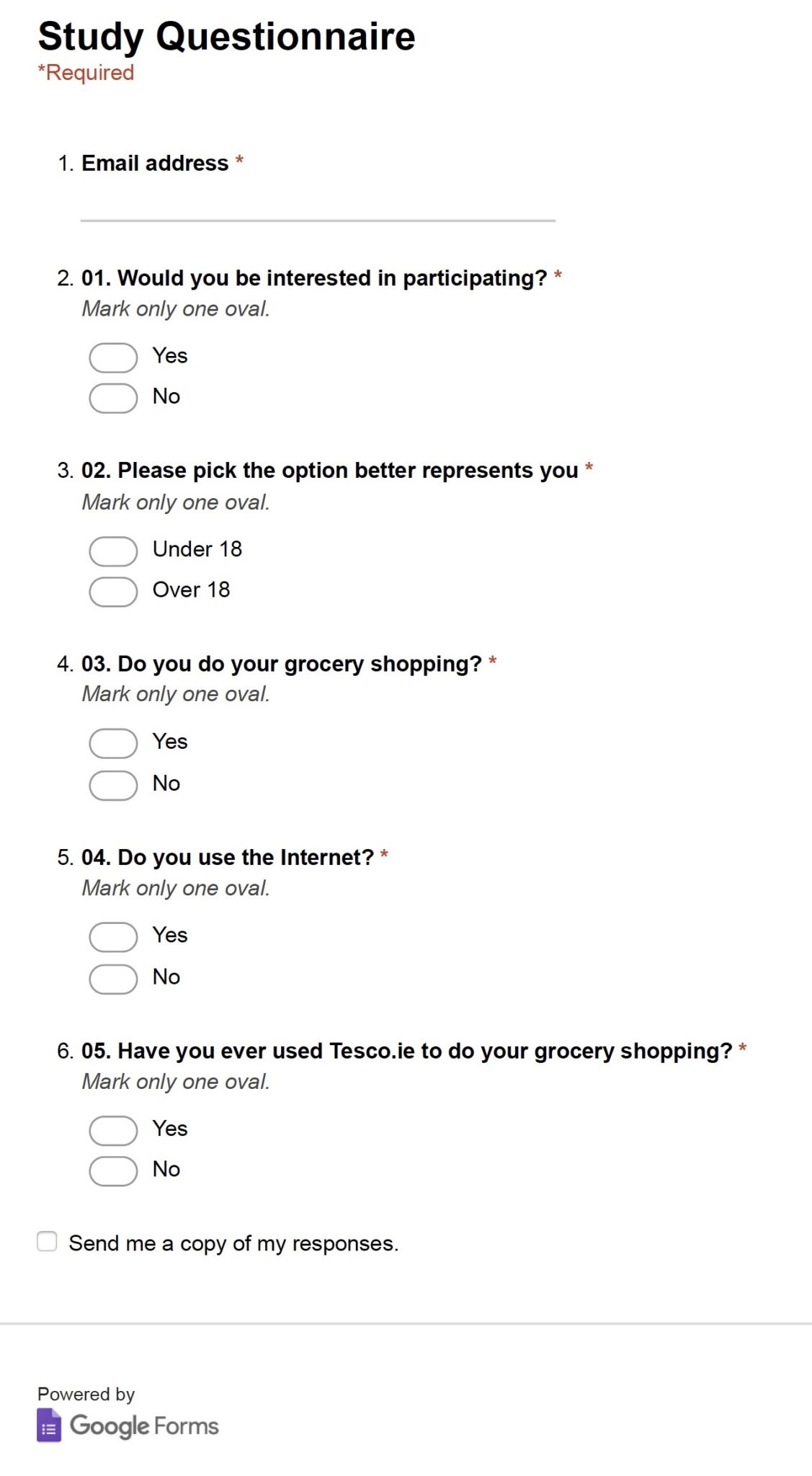
2. Recruiting Participants
3. Selecting Tasks
Each task was worded without giving clues on how to complete the task. The goal was to let the users attempt to solve the task based on their understanding of the website. Finding and choosing their preferred bottle of wine or dessert was designed as an exploratory task, to gain insights into the user’s decision-making process and to see how the site helps them browse and choose products. Other tasks were testing if the users can find specific items.
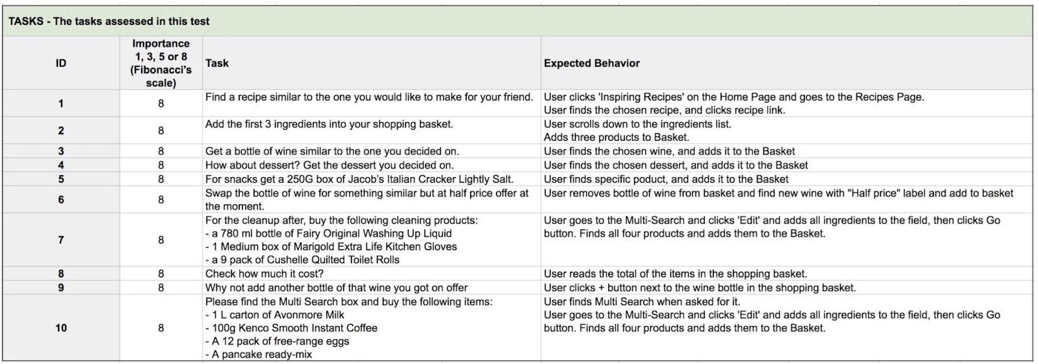
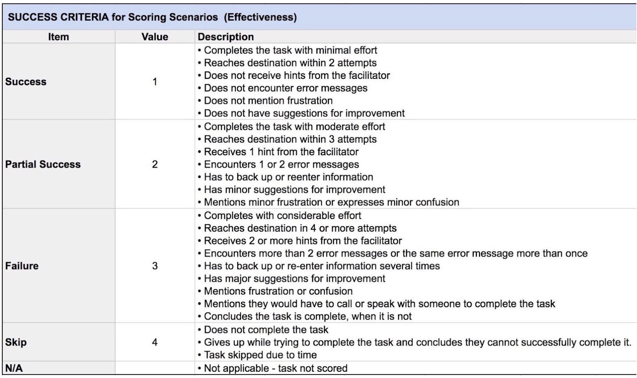
For each task, importance was set using the Fibonacci’s scale: 1,3,5,8 and expected behaviour was defined, allowing each attempt to be measured as a success, partial success or failure.
4. Creating Tasks Scenarios
We wrote a scenario to provide participants with context and help them engage with the interface.

5. Planning Sessions
The test plan was created to define objectives of the study, assign participants to researchers, assign test type to the participants, describe the environment, equipment and logistics, define task list and scenario, list evaluated elements of the website, define metrics and success criteria.
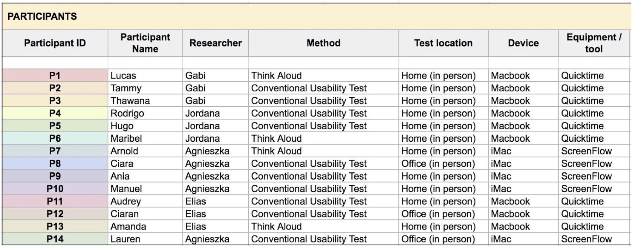
Selected participants were assigned to four researchers. Tests took place at the researcher’s offices or homes. The duration of each session was approximately 40 minutes. Laptops and desktop computers with Quicktime or ScreenFlow were used to capture the screen recordings and conversations.
6. Measuring and Recording
Each participant was asked to sign the Consent Form and complete tasks in the same order. Priming activity and usability test were recorded. Participants’ reactions were observed during tests and afterwards from the recordings. Notes were taken during and after each session. All the recorded materials were stored on the Google Drive and shared among researchers.
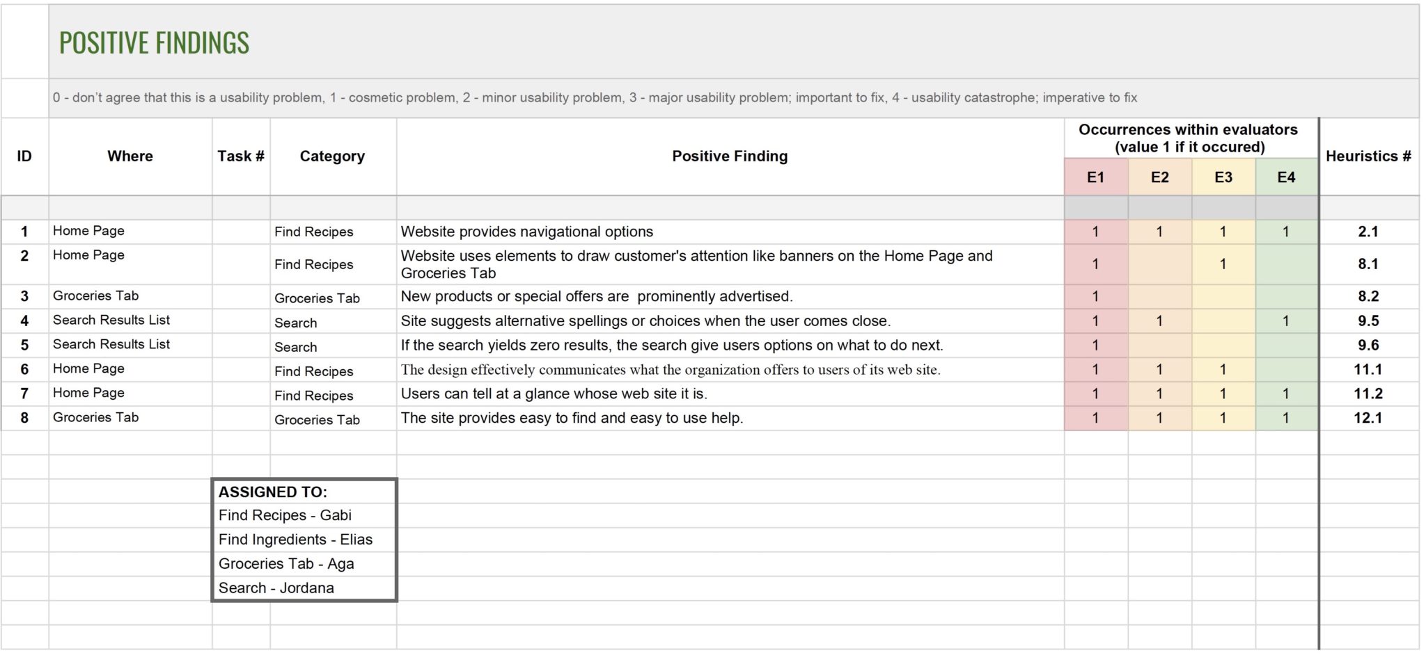
For collaboration purposes, to collate all test results and to avoid writing exhausting reports, Rainbow Spreadsheet.
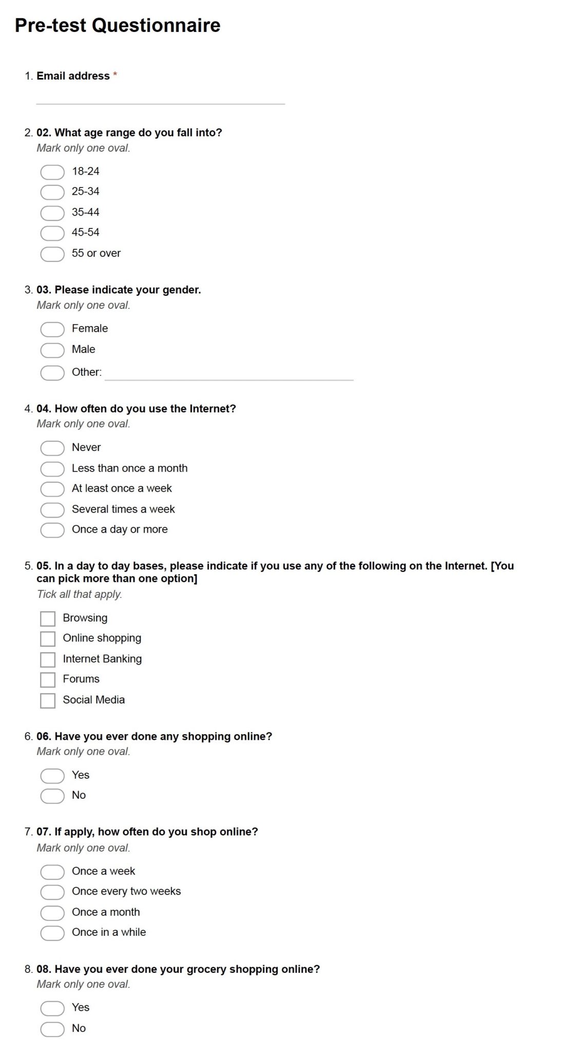
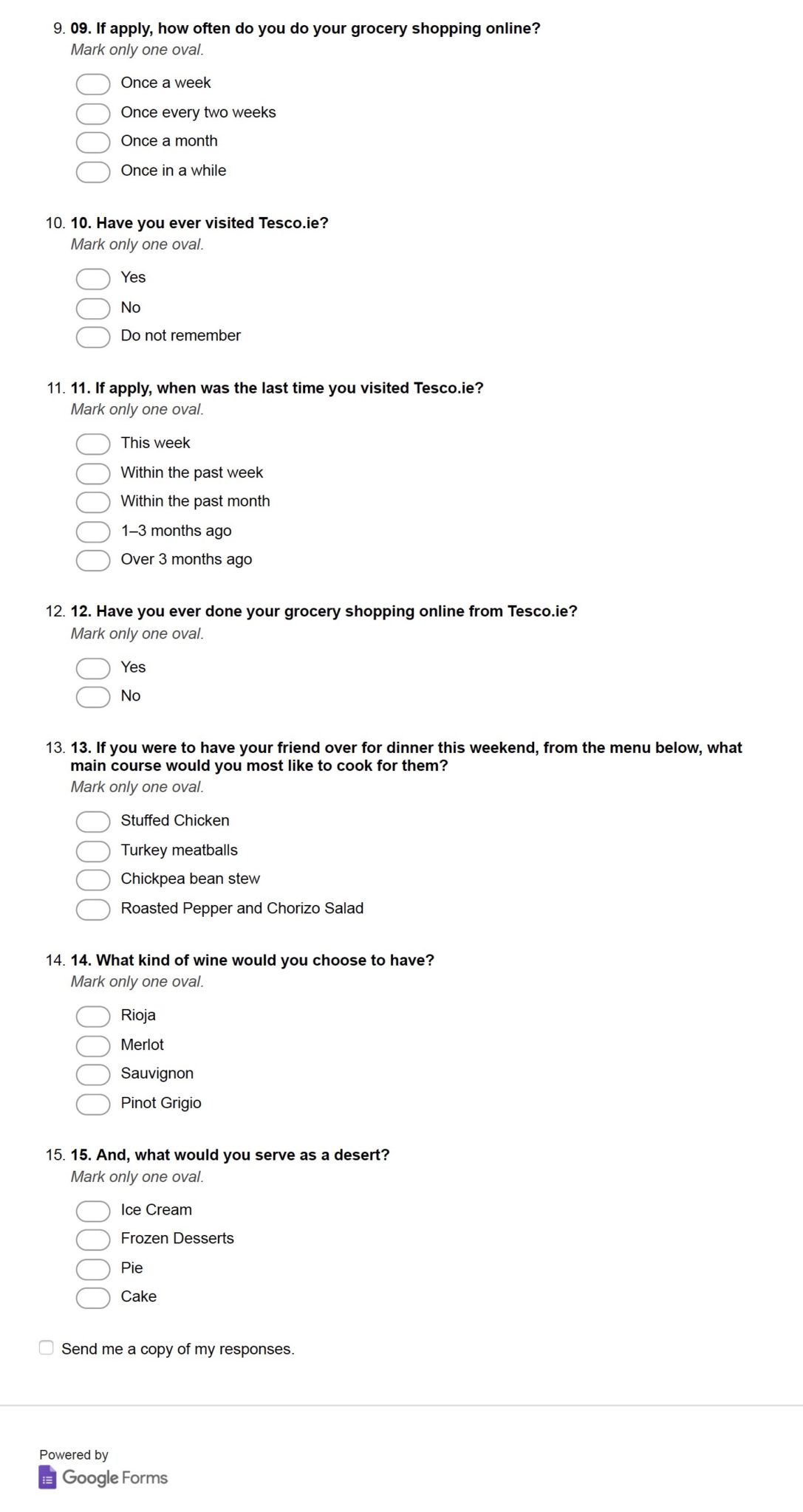
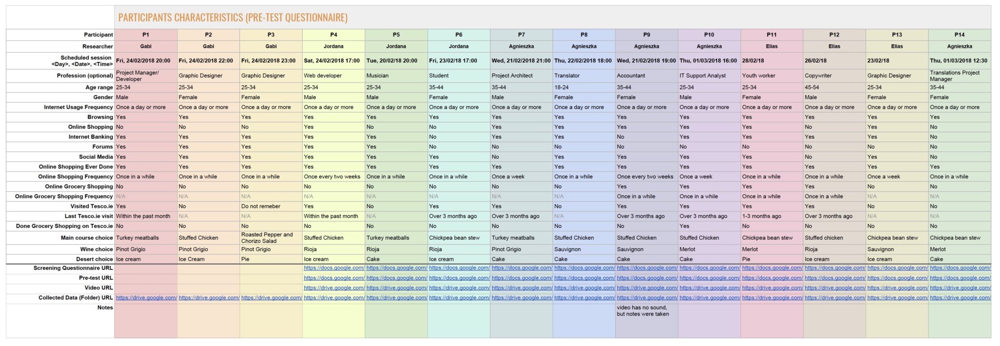
6.1 Pre-test Questinnaire
The questionnaire was created with the help of Google Forms. Prior to the test session, participants were asked a series of background questions. The goal was to collect demographic data and prepare participants for the usability testing.
The Rainbow Spreadsheet was used to collate all the qualitative and quantitative results, analyse it, make calculations, remove duplicates and prioritise based on the same criteria. Each participant had an ID (P1, P2, etc.), colour code and was assigned to one of the evaluators who was conducting tests and entering data.
6.2 Usability Testing
Conventional Usability Test and Think Aloud Test.
The facilitators’ role was to provide an overview of the study to participants, define the purpose of usability testing, respond to requests for assistance, record participants’ actions and comments. The facilitators were following the procedure described in the Usability Testing Guide and were taking notes.
To help participants relax before the test, they were asked a few “tell me about yourself” questions and about Tesco.ie Home Page. After that, participants were provided with the printed list of tasks to be completed and asked to complete each of them one at the time. In the case of think-aloud testing, participants were asked to tell what they were doing and thinking at every moment and task on time was not recorded.
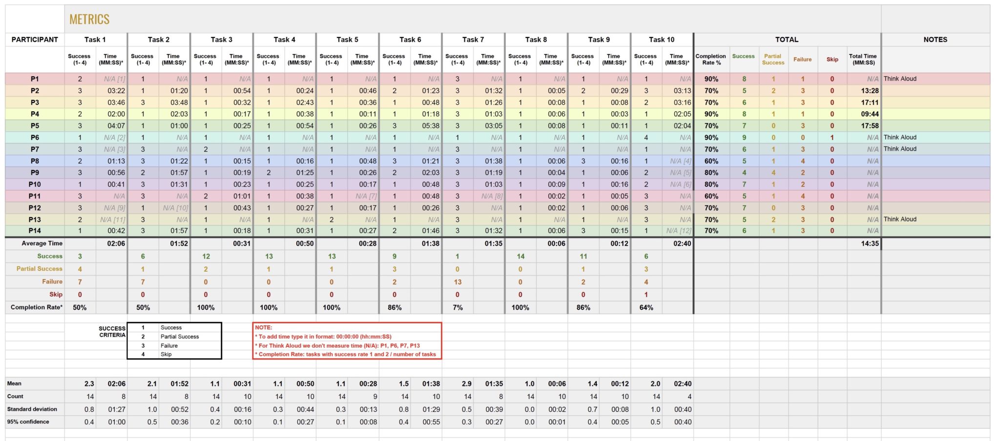
Tasks Completions Rate (Effectiveness)
The occurrences of tasks with a success rate of 1 or 2 were counted, divided by the number of tasks undertaken and multiplied by 100% to calculate average completion rate percentage. This percentage presents how effective Tesco.ie is when users are trying to complete tasks.
The completion rate of the whole test per participant was, in its majority, 70% or less. Based on Sergeev (2010), the effectiveness of Tesco.ie is bad

All participants succeeded in completing tasks 3,4,5 and 8, with a completion rate of 100%. Only one participant succeeded in Task 7, using “Multisearch” box without a Facilitator’s help.
Screen recordings were used to measure how long it took to complete every task. In case of think-aloud tests and tasks with a success score of 3 or 4, time was not measured. The average time on a task allows estimating the efficiency of Tesco.ie if compared with benchmarks from competitors websites.
6.4 SUS Questionnaire
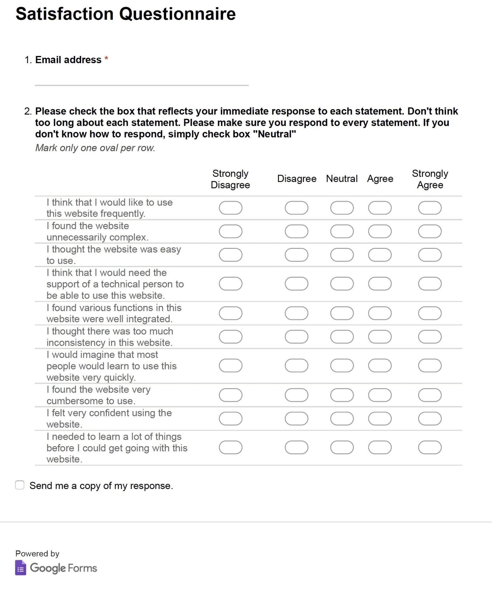
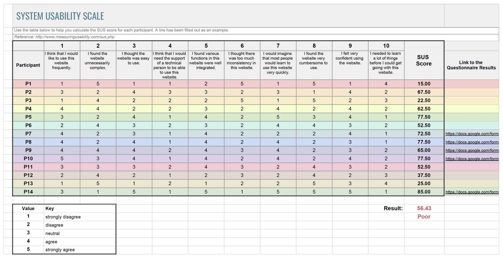
To measure satisfaction, participants were asked to fill in the System Usability Scale (SUS) questionnaire. It is a quick and cheap method tested for over 30 years. Participants ranked 10 questions from 1 to 5, based on their level of agreement. The score was calculated in a spreadsheet and compared with the industry standards.

SUS questionnaire was filled by all the participants. The collected results indicated that the participants less satisfied with the website, in its majority, were the ones with a design background (15%, 22.50% and 25% SUS score). Although the overall score was 56.43%, meaning that the user satisfaction is poor when compared with industry scores suggested by Sauro & Lewis (2016).
7. Capturing and Analysing the Results
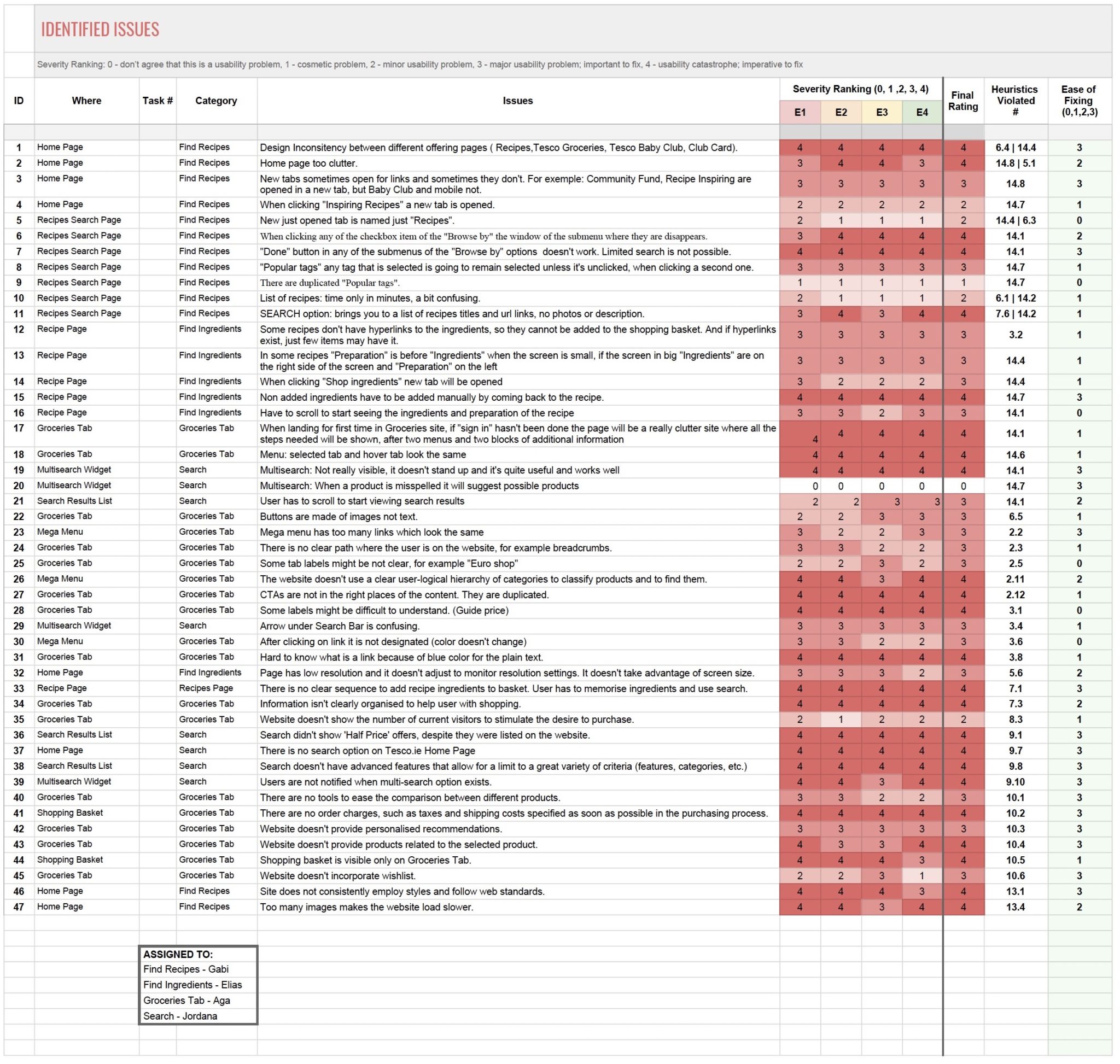
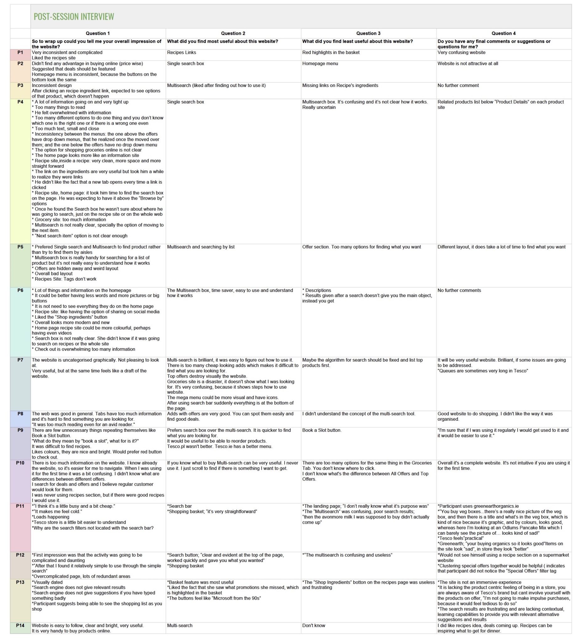
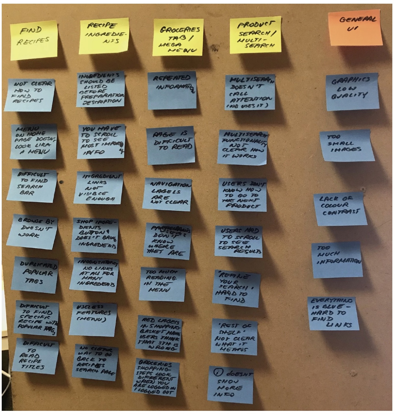
Initially, issues were grouped using affinity diagramming technique (Pernice, 2018). Each group was based on the tasks given to the participants: Recipe Search, Recipe Page, Groceries Tab, Search and also General UI.
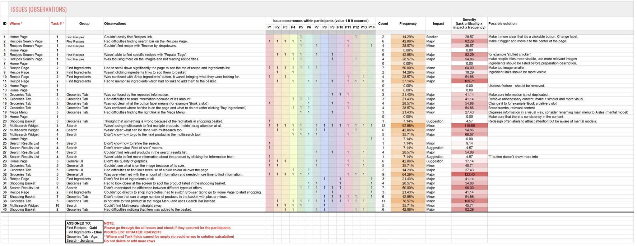
Two lists were created in the Rainbow Spreadsheet: identified issues and positive findings, they were extended later with the observations extracted from evaluations.
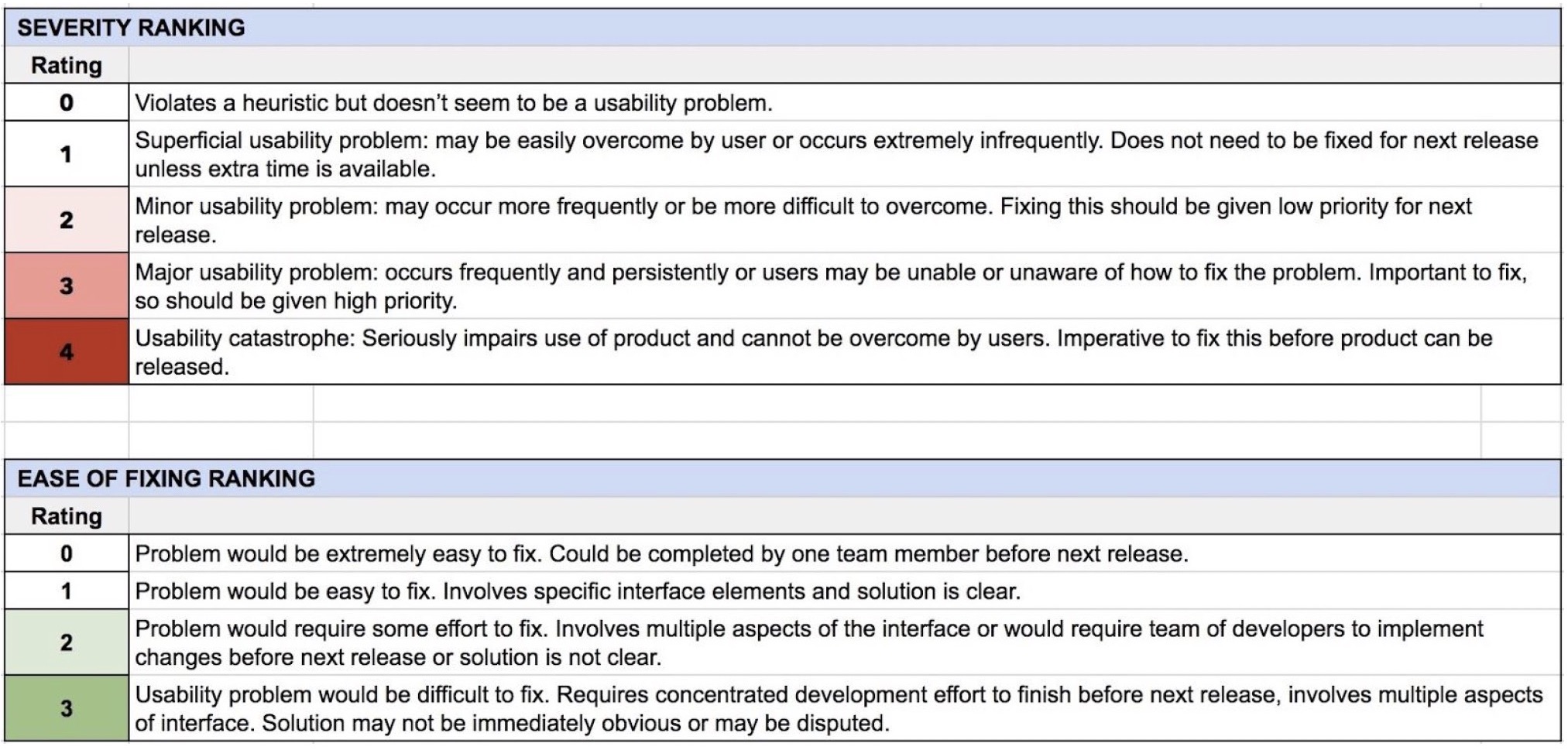
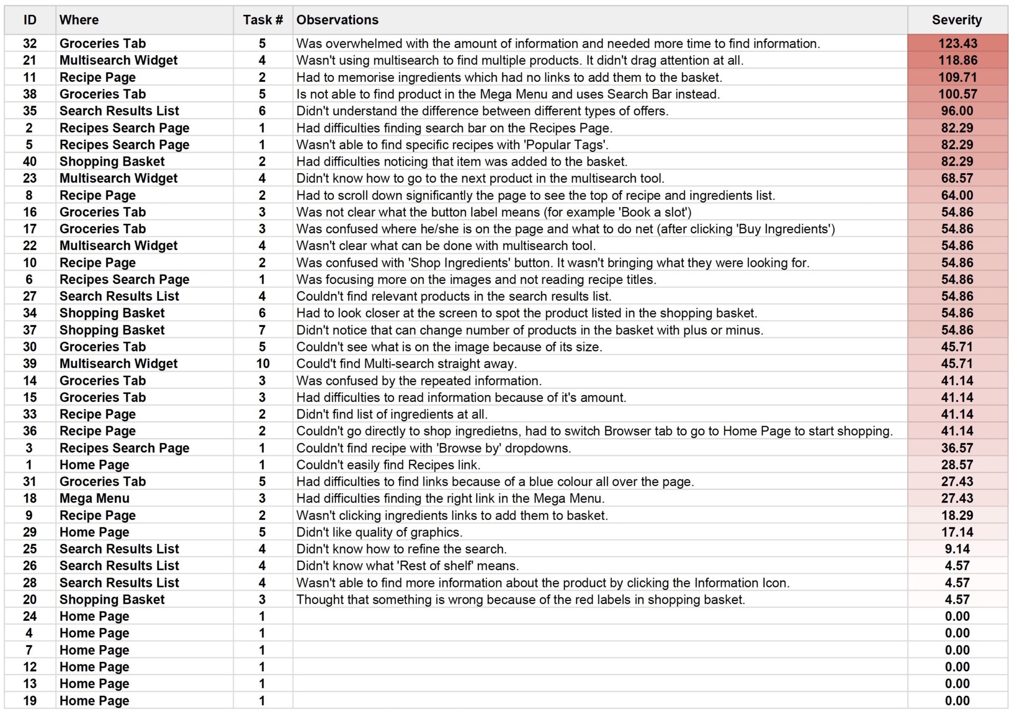
For each observation, it was counted how many participants encountered that specific issue showing the frequency of it. Criticality of each task and impact of each issue were set by the evaluators providing the parameters needed to calculate the severity (task criticality x impact x frequency). Once the severity was known, the issues were prioritised.
RECOMMENDED DESIGN CHANGES
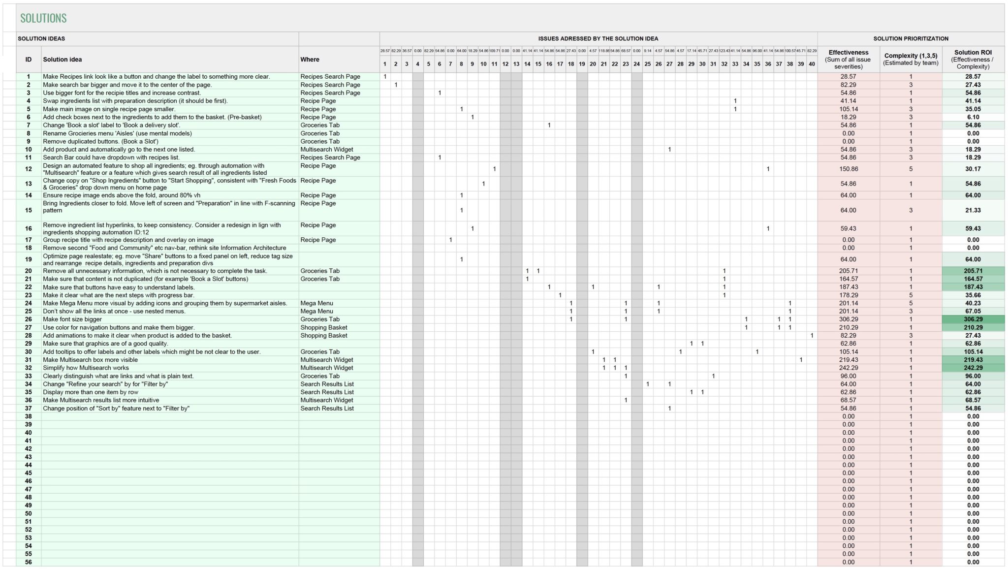
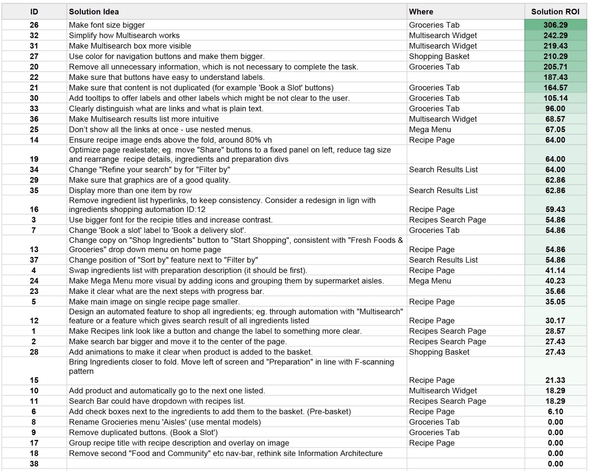
A range of issues was identified with both methods. After brainstorming, all the solutions were collated in the spreadsheet and marked which issues they are solving. For each solution, ROI (return on investment) was calculated by dividing effectiveness (sum of all issue severities) by complexity to implement it, estimated by the team. Next, solutions were prioritised to implement first those with the highest ROI.
RECOMMENDATIONS & PROPOSED DESIGN CHANGES
HOMEPAGE
SOLUTION:
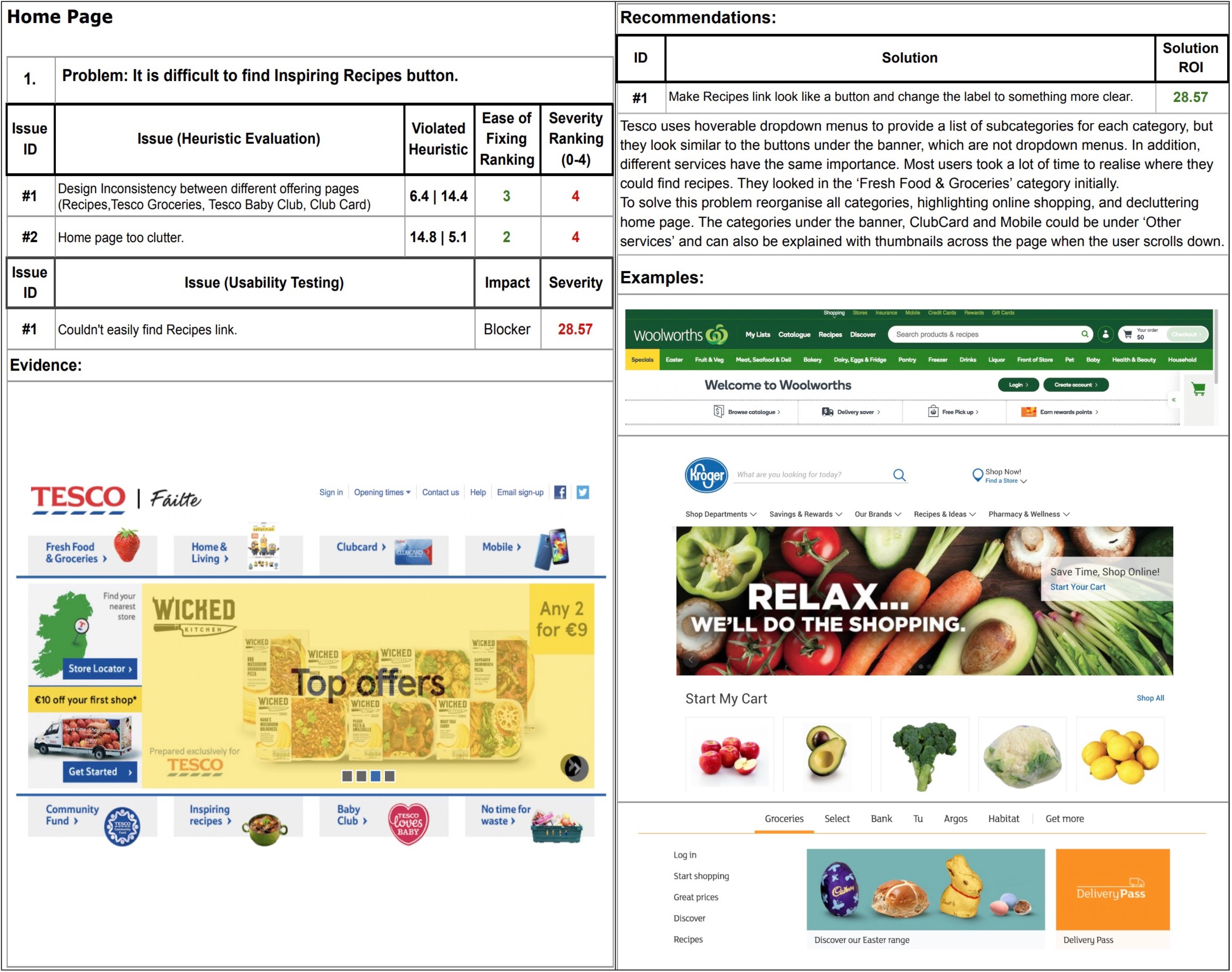
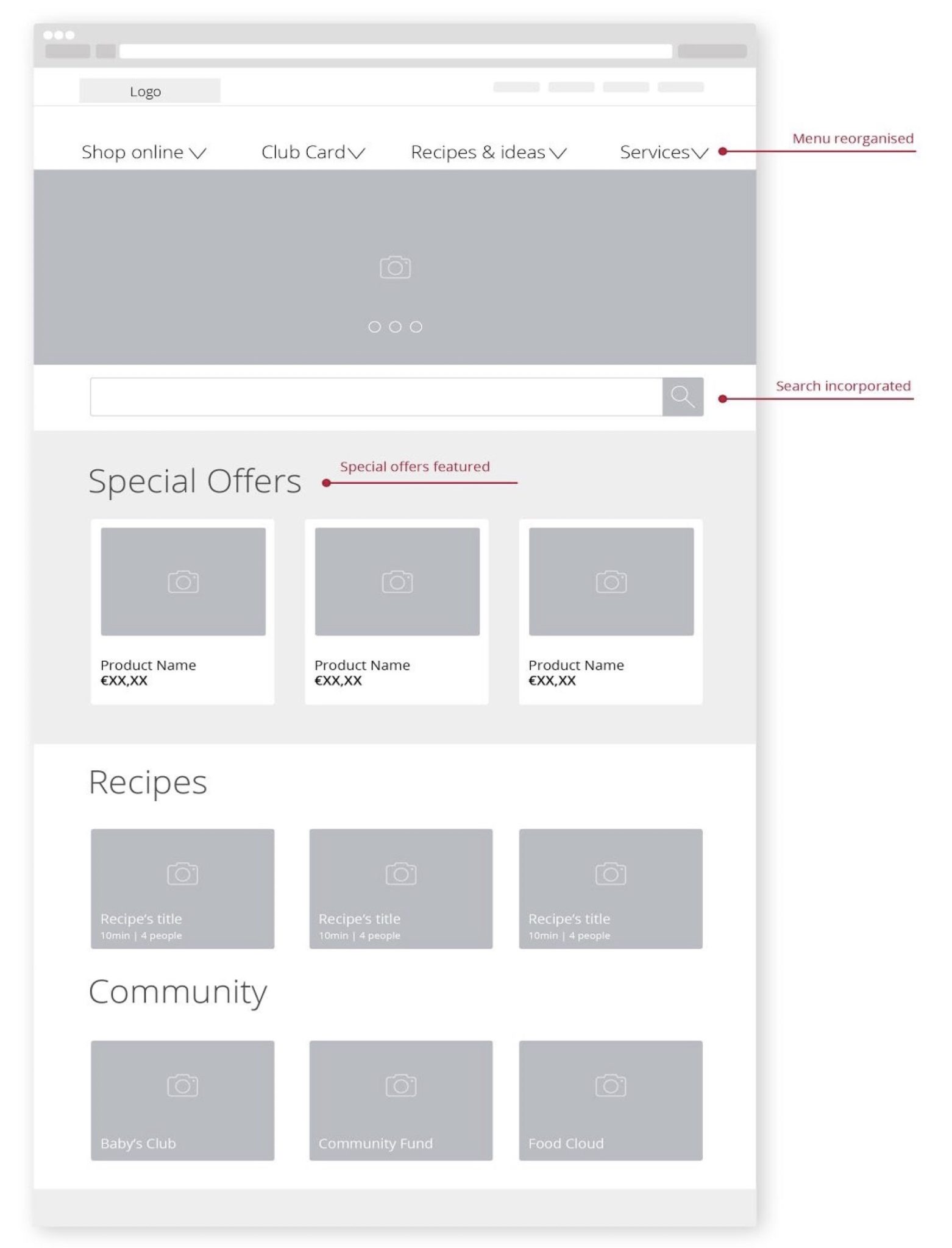
Users felt overwhelmed when visiting Tesco.ie: “There are too many different calls to actions on the Homepage and most of them don’t apply to me.” It was necessary to establish a hierarchy of elements such as menus, images, and messages, prioritising and making critical information more visible (Philips, 2016). Use of white space (Soegaard, 2018), as well as better quality images and more contrast (Tubik Studio, 2017), was required to support readability. The proposed design aims to remove the excess of information and follow the Aesthetic and Minimalist Design Principle (Philips, 2016). It is also recommended, to redesign all Tesco.ie subpages to improve consistency and learnability (Philips, 2016).
RECIPES SEARCH PAGE
SOLUTION:
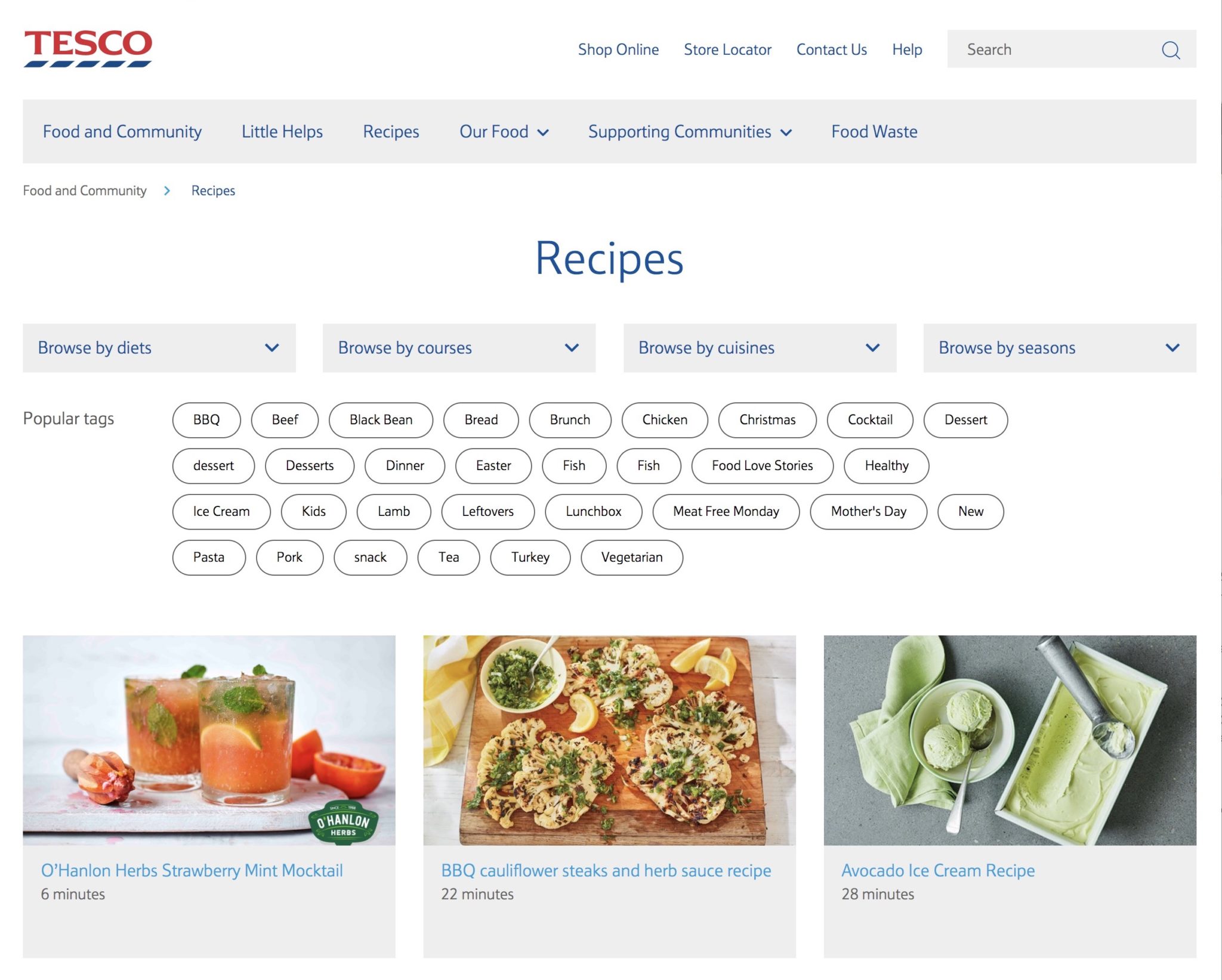
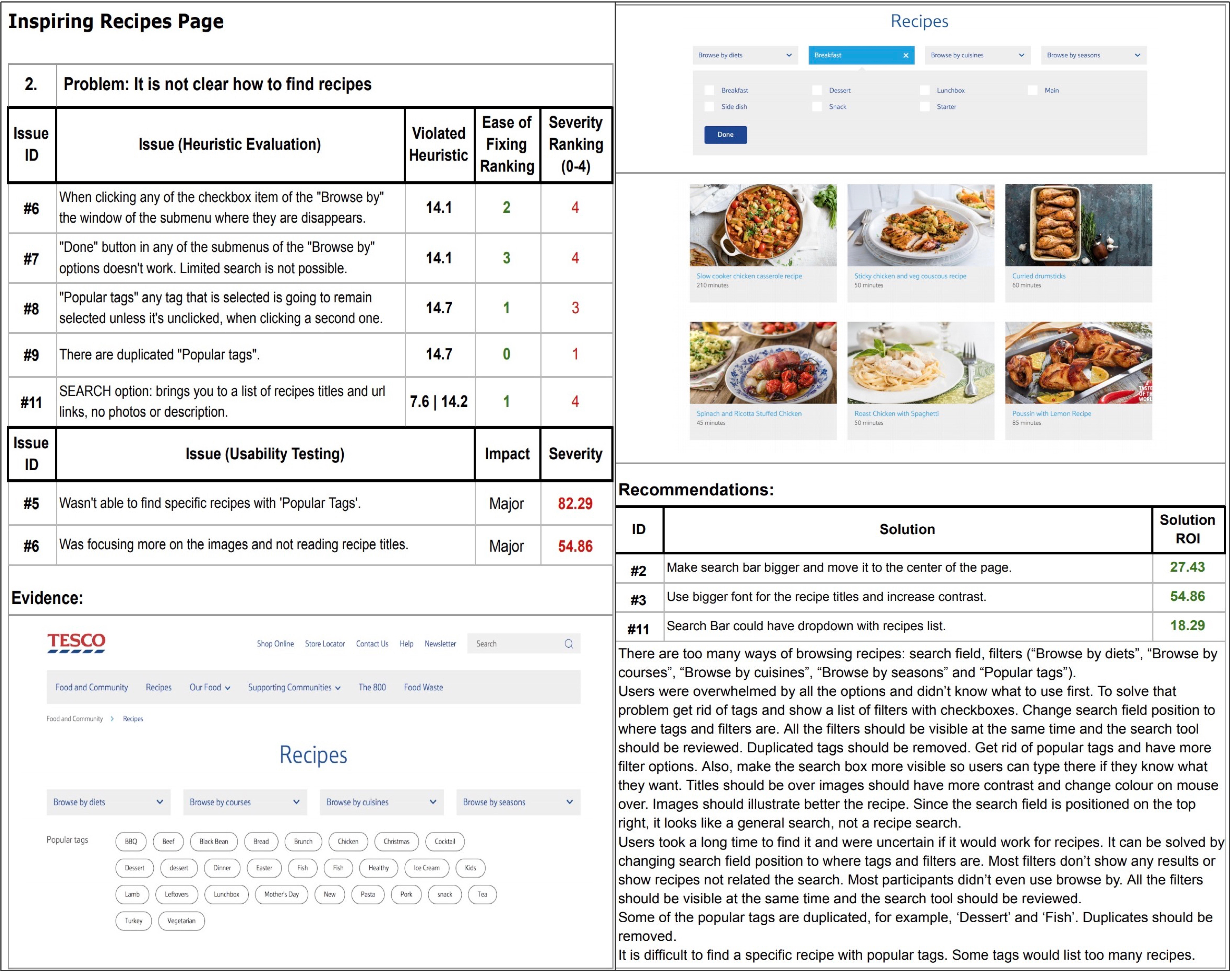
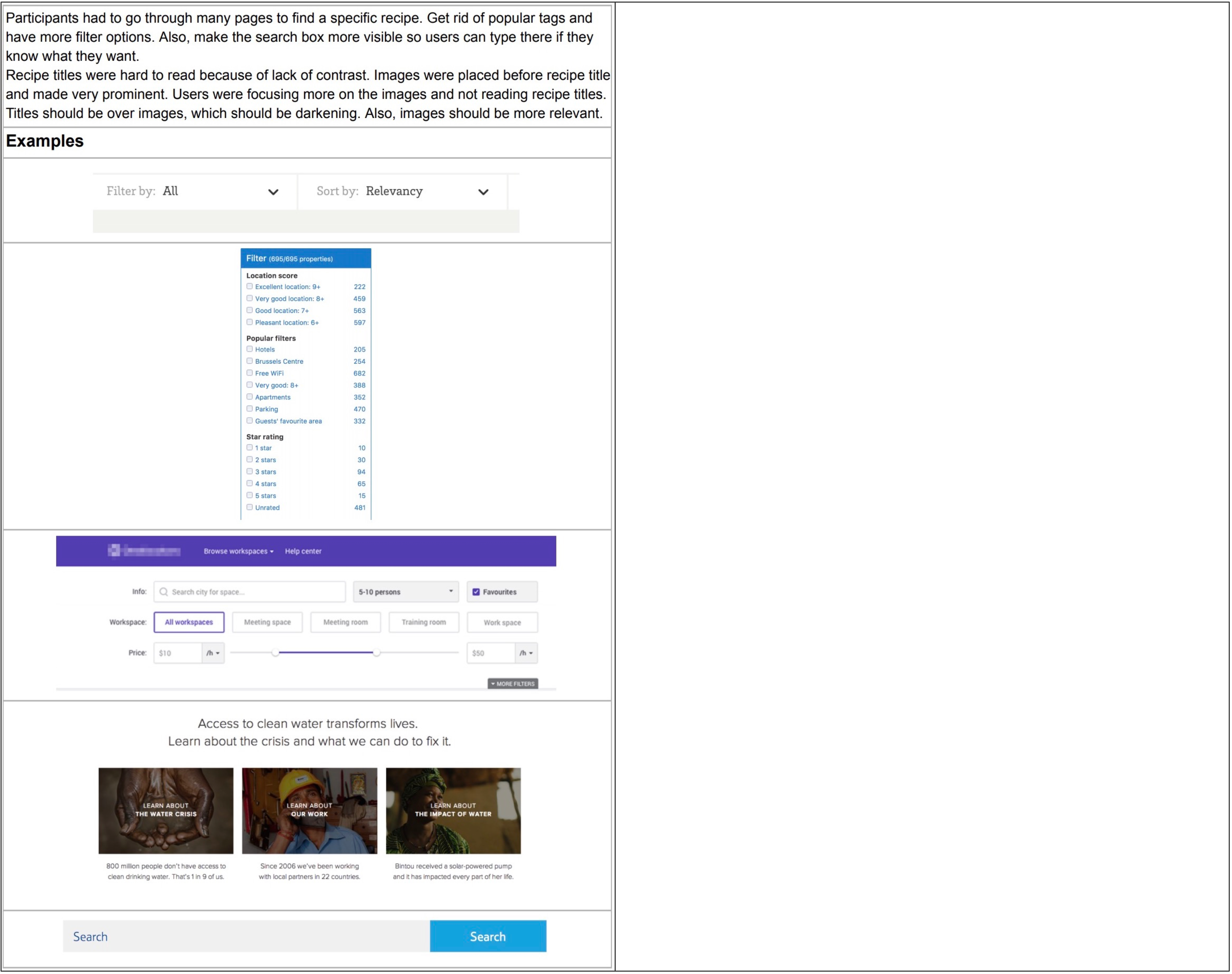
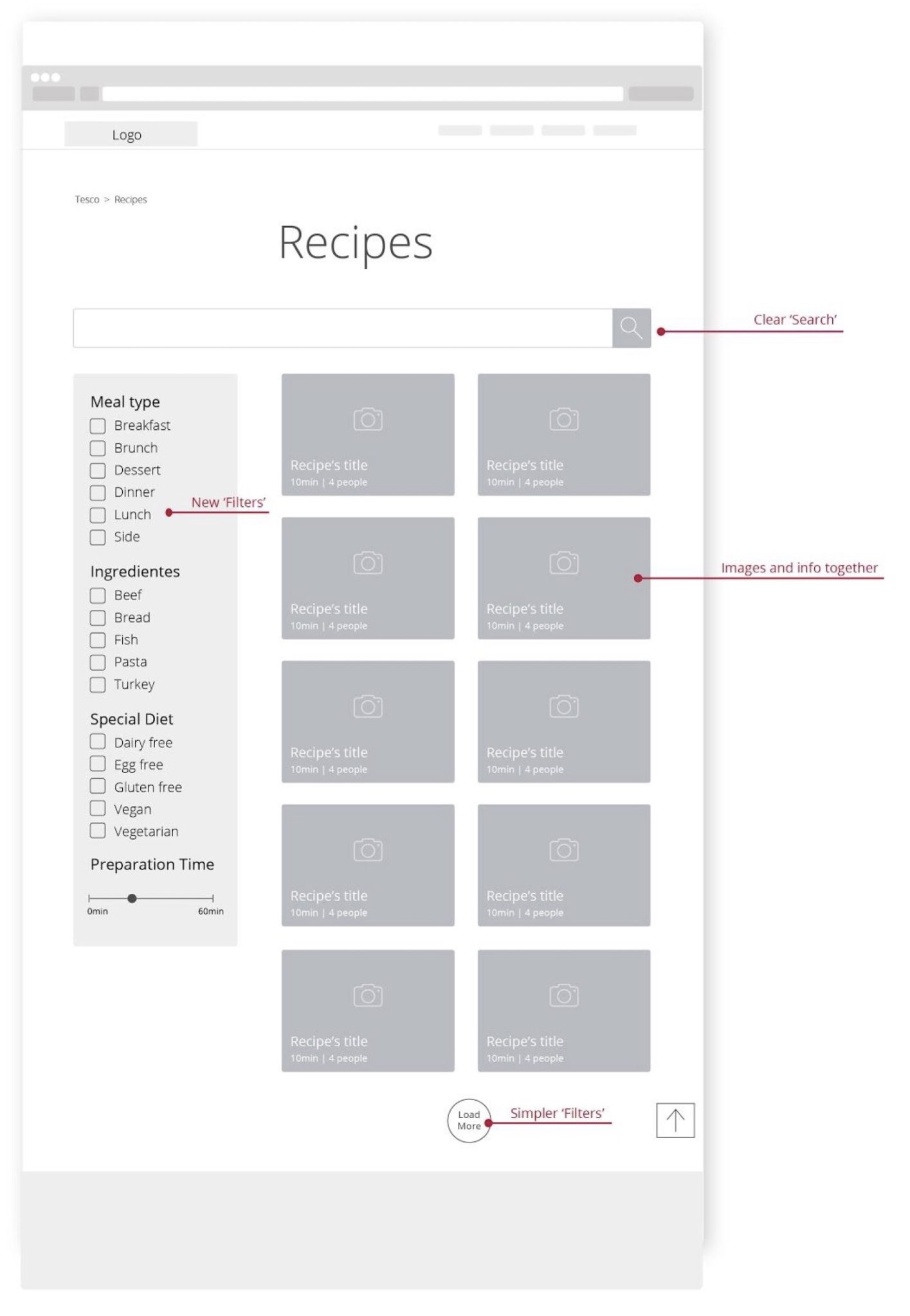
The number of browsing options and their ineffectiveness was confusing to the users. The feature Browse By and Tags are replaced by checkboxes Filters. Following the Visual Hierarchy rule (Philips, 2016), the Search Bar was moved closer to the Filters, so users can see it straight away and know it is a Search Bar to find recipes. According to some participants, it looked more like a “general search” rather than a recipe search because of where it was placed. Recipes thumbnails and texts are redesigned, so users can notice the recipe titles instead of misleading images. Titles, preparation time and servings are placed on the images. The new recipes load when the user clicks the Load More button.
RECIPE PAGE WITH LIST OF INGREDIENTS
SOLUTION:
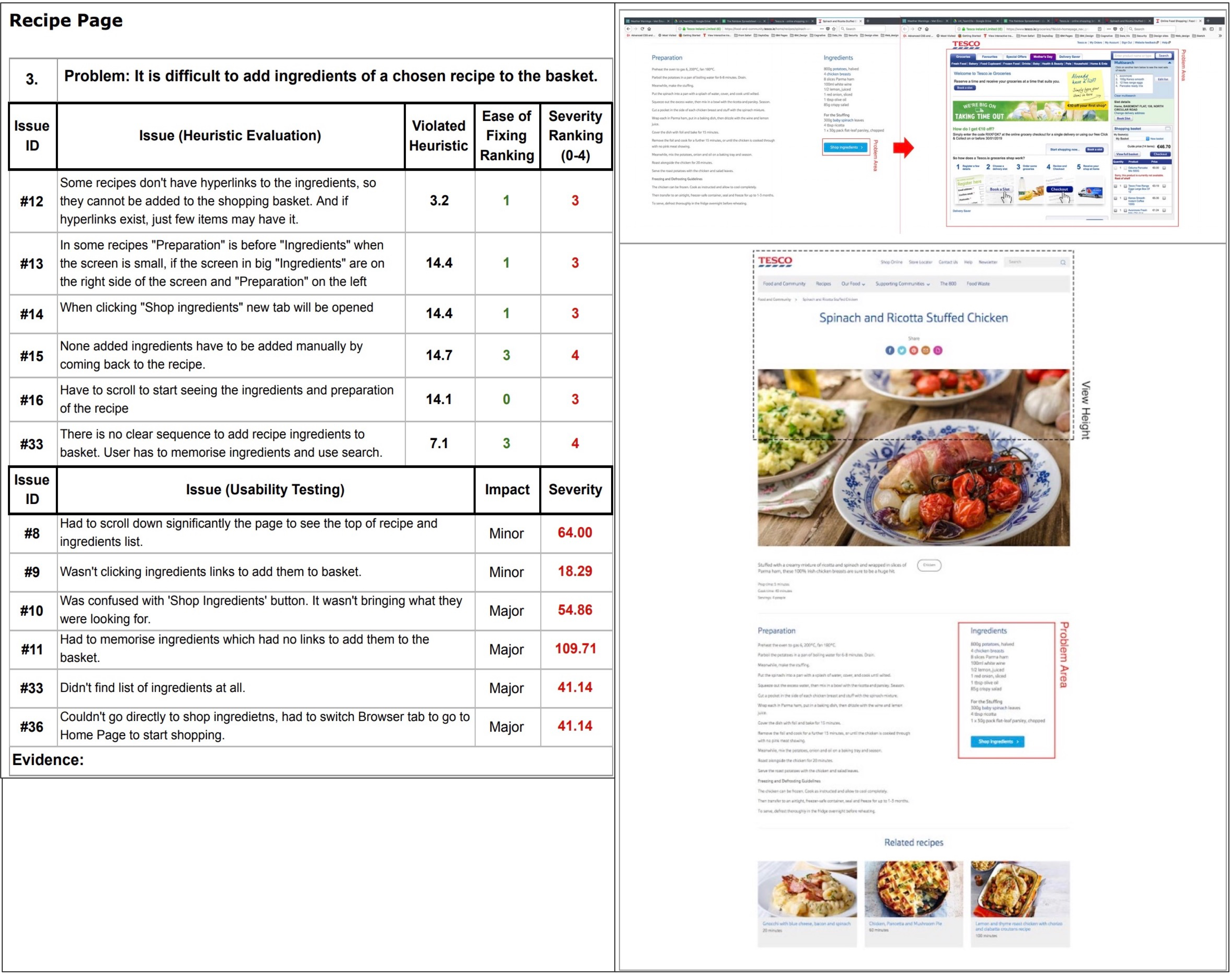
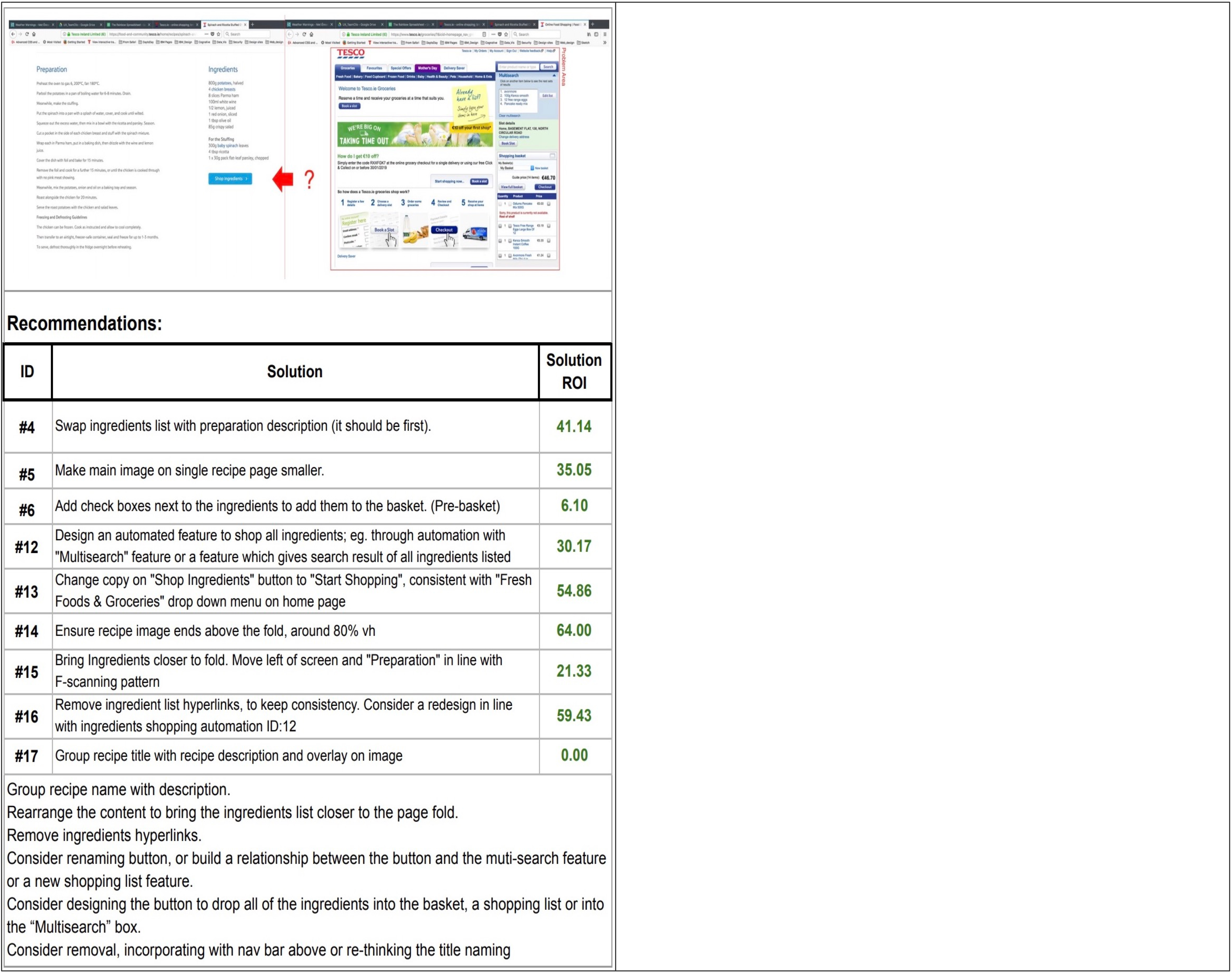
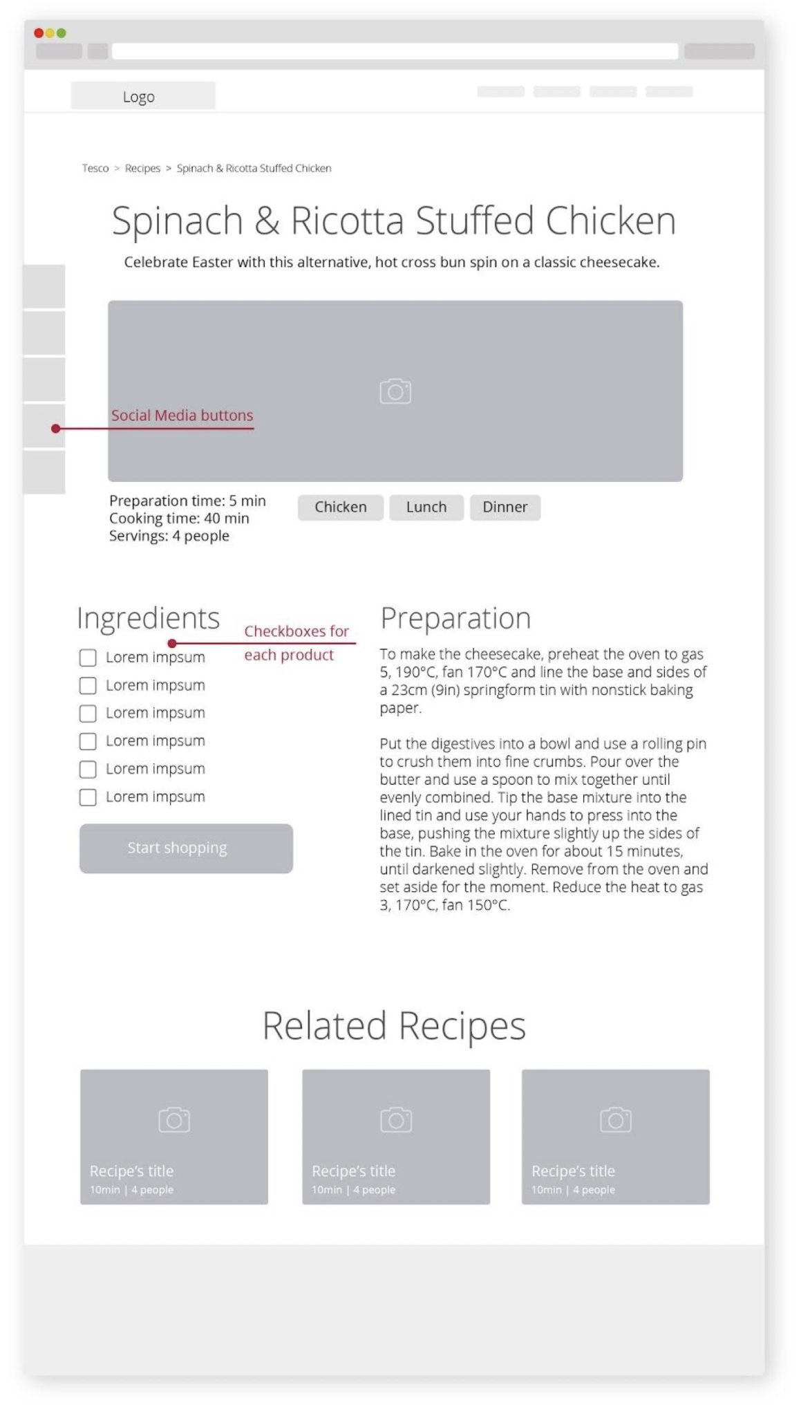
On Recipe Page, information most relevant to the user’s search was placed below the fold. According to the Visual Hierarchy principle (Philips, 2016), content had to be rearranged to show ingredients above the fold. During the expert review, it was identified that F-Pattern for reading content is not followed on this page (Babich, 2017). In the new design, the ingredients list was moved to the left to help users read the recipe. The description is positioned under the title and share buttons are placed in a side panel. All ingredients links were removed and checkboxes added, allowing users to tick the ingredients they wish to buy. ‘Shop Ingredients’ button was renamed to ‘Start Shopping’, to match homepage drop-down menu. “So where is the food now?” participants were asking after clicking on Shop Ingredients, and being redirected to the Groceries Page. Instead, they should be able to see the ingredients options recommendations. The Navigation Bar was removed as its links were irrelevant (Philips, 2016) for the users who were looking for recipes.
GROCERIES TAB
SOLUTION:
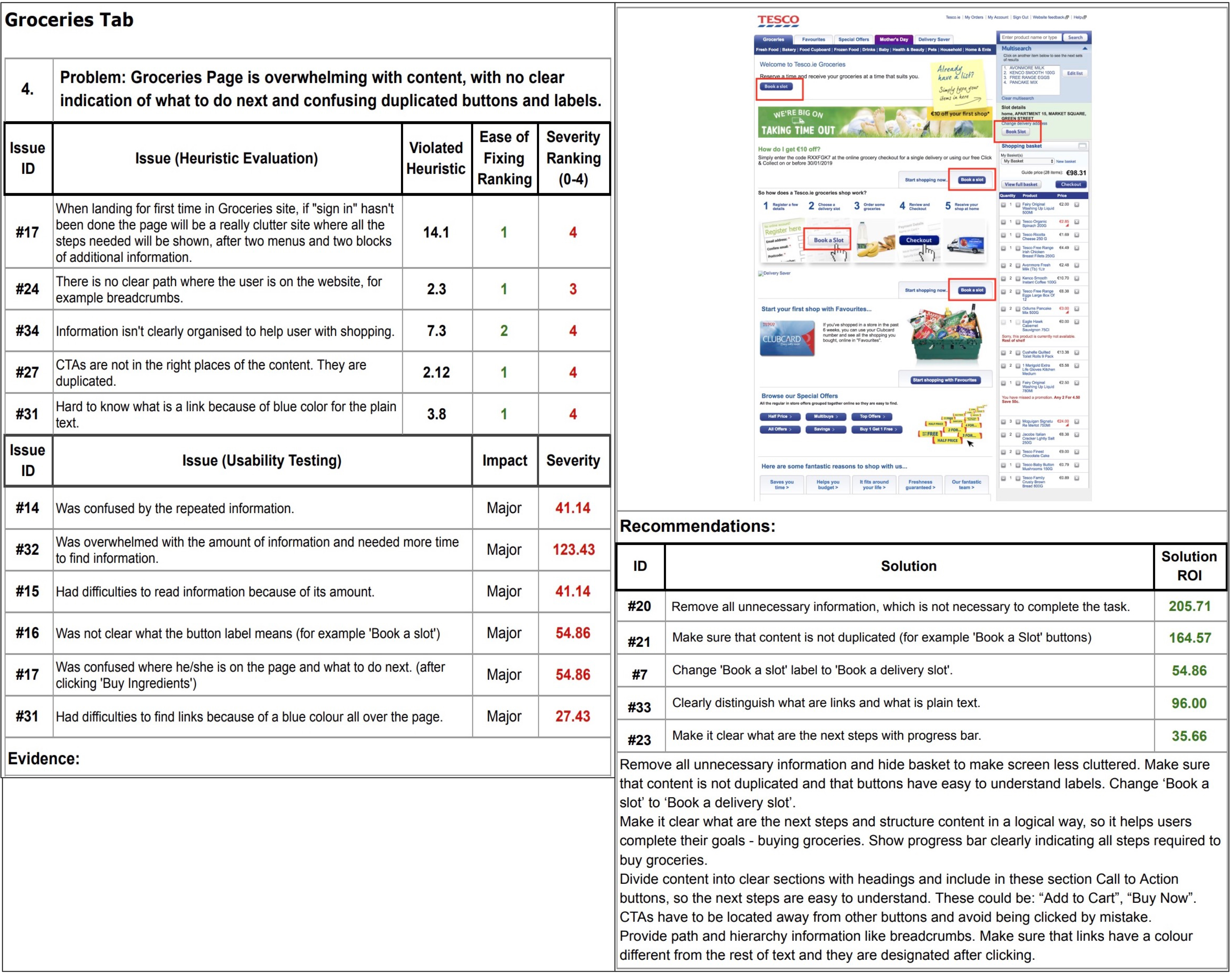
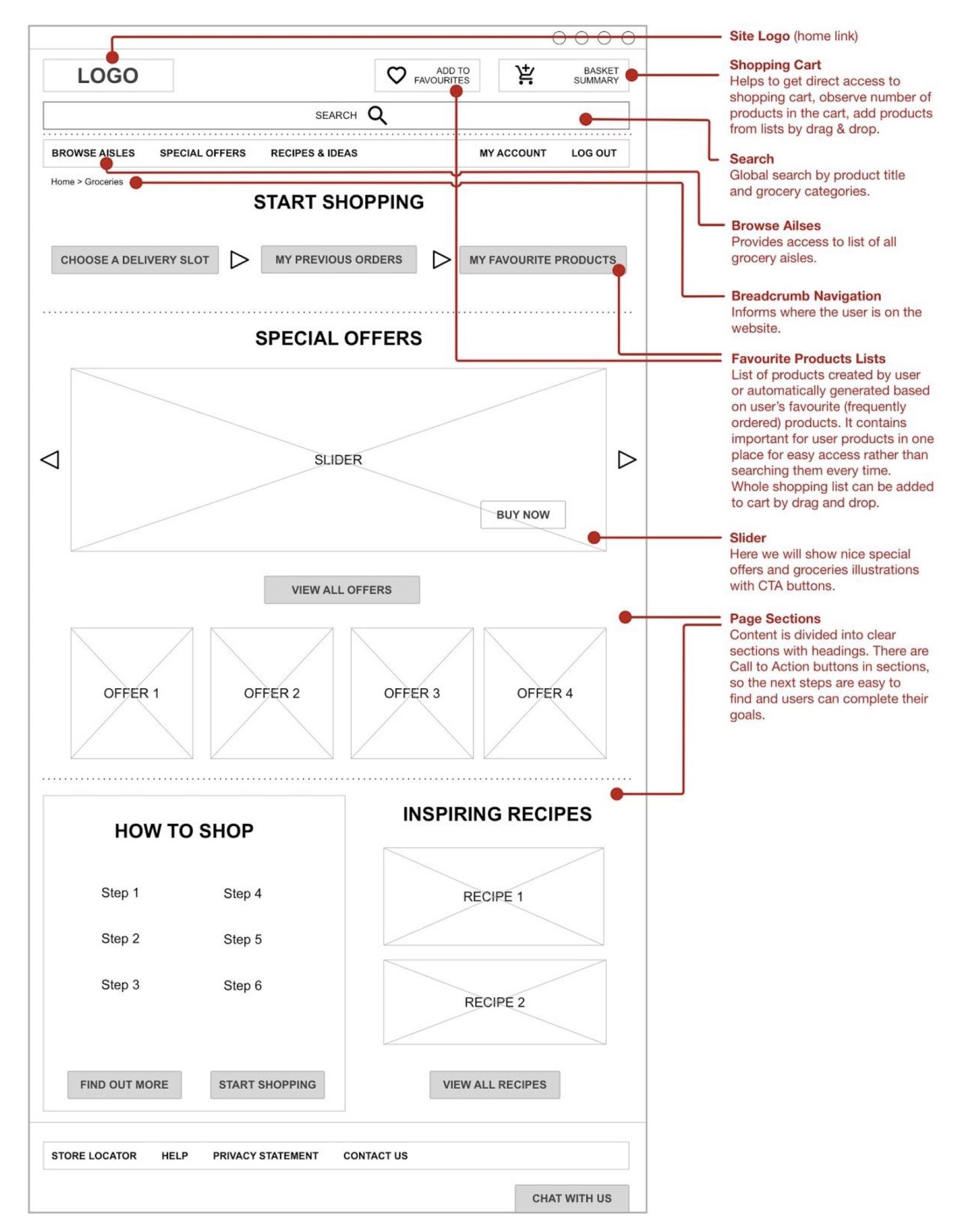
The main complaint about the Groceries Tab was the excessive amount of information and duplicated buttons which slow down the shopping. One participant said, “I’d rather go to the physical shop because there’s so much going on here”. In the proposed design all unnecessary or duplicated content is removed and the full basket is hidden to keep the only necessary minimum in front of the users (Philips, 2016). Content is divided into clear sections with visible Call to Action buttons (Alton, 2016). Hard to understand labels, like “Book a slot”, was renamed to improve discoverability (Philips, 2016). Further research should be conducted to name all the labels in an easy to understand way and improve findability (Thurow, 2015).
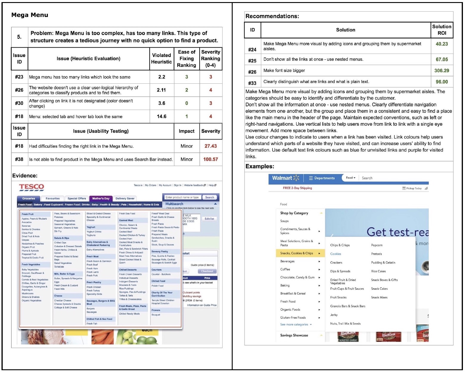
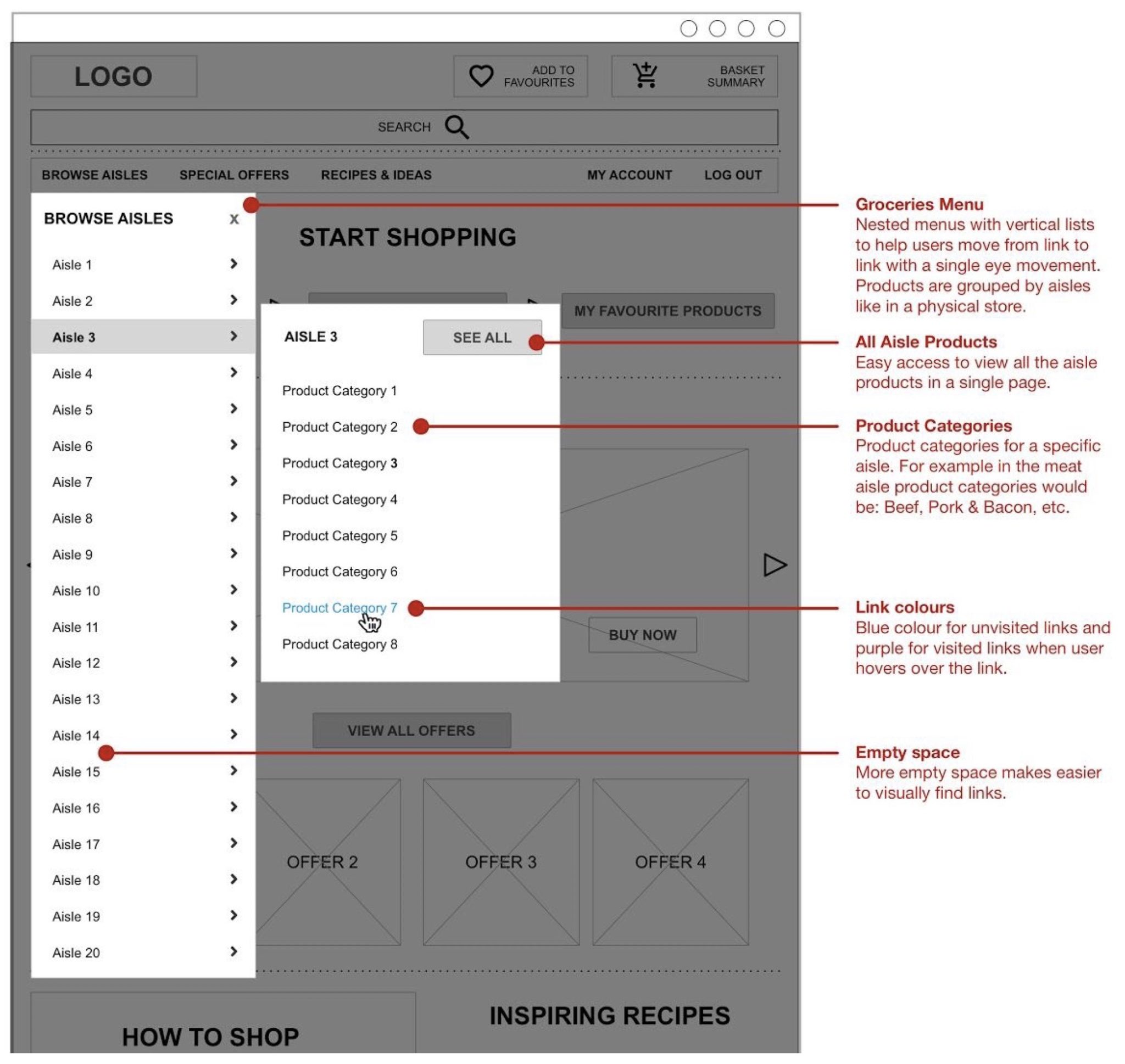
MEGA MENU
SOLUTION:
The cluttered menu was replaced by nested menus with vertical lists to avoid showing all the information at once, follow the design concept of constraints (Philips, 2016) and improve the speed of scanning it by the users (Nielsen, 2009). The new menu also helps users to move from link to link with a single eye movement (Babich, 2017). Colour changes help users to navigate (Nielsen, 2004). Products are grouped by aisles like in a physical store to utilise customers mental model (Philips, 2016) and make the experience more intuitive (Krug, 2014).
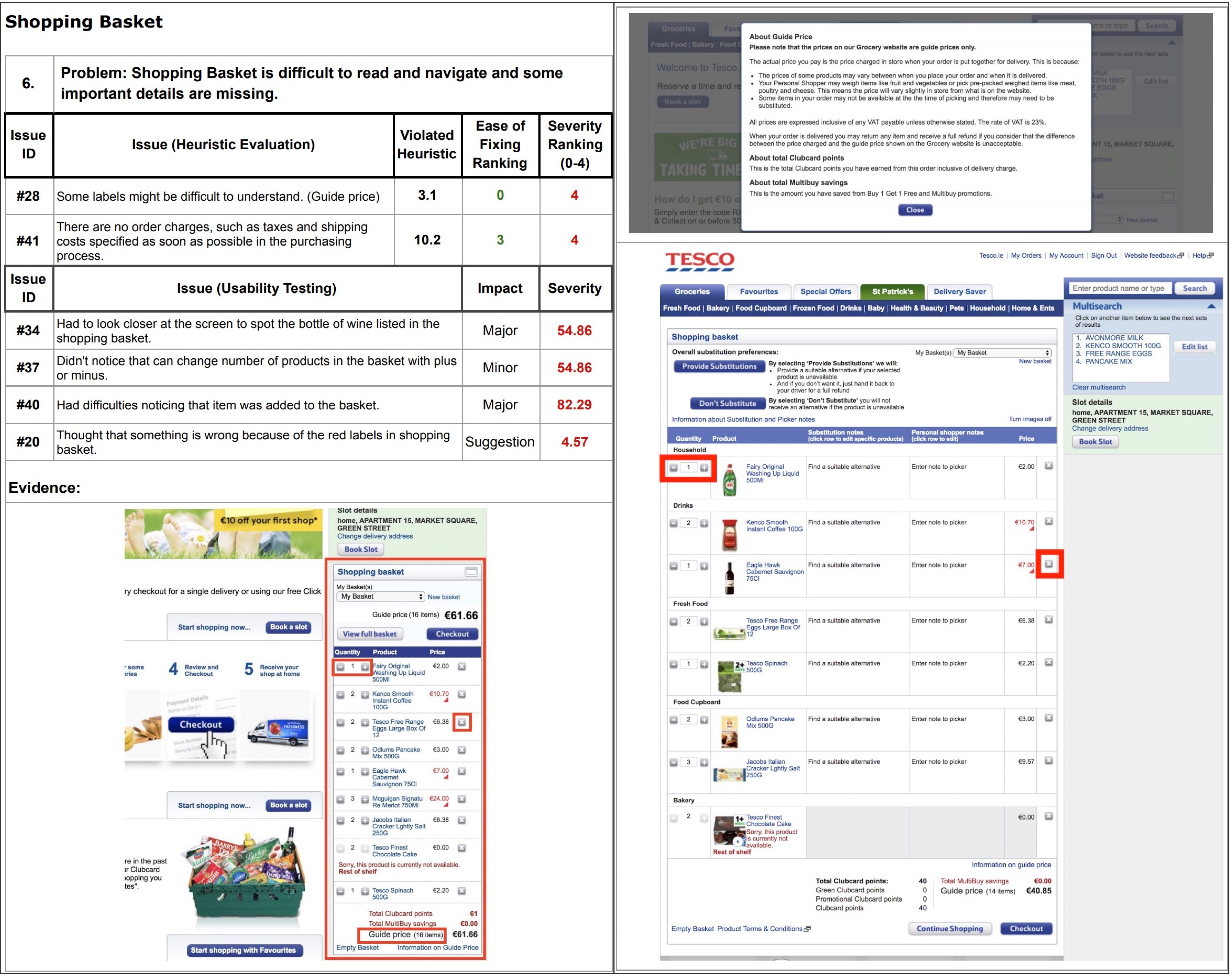
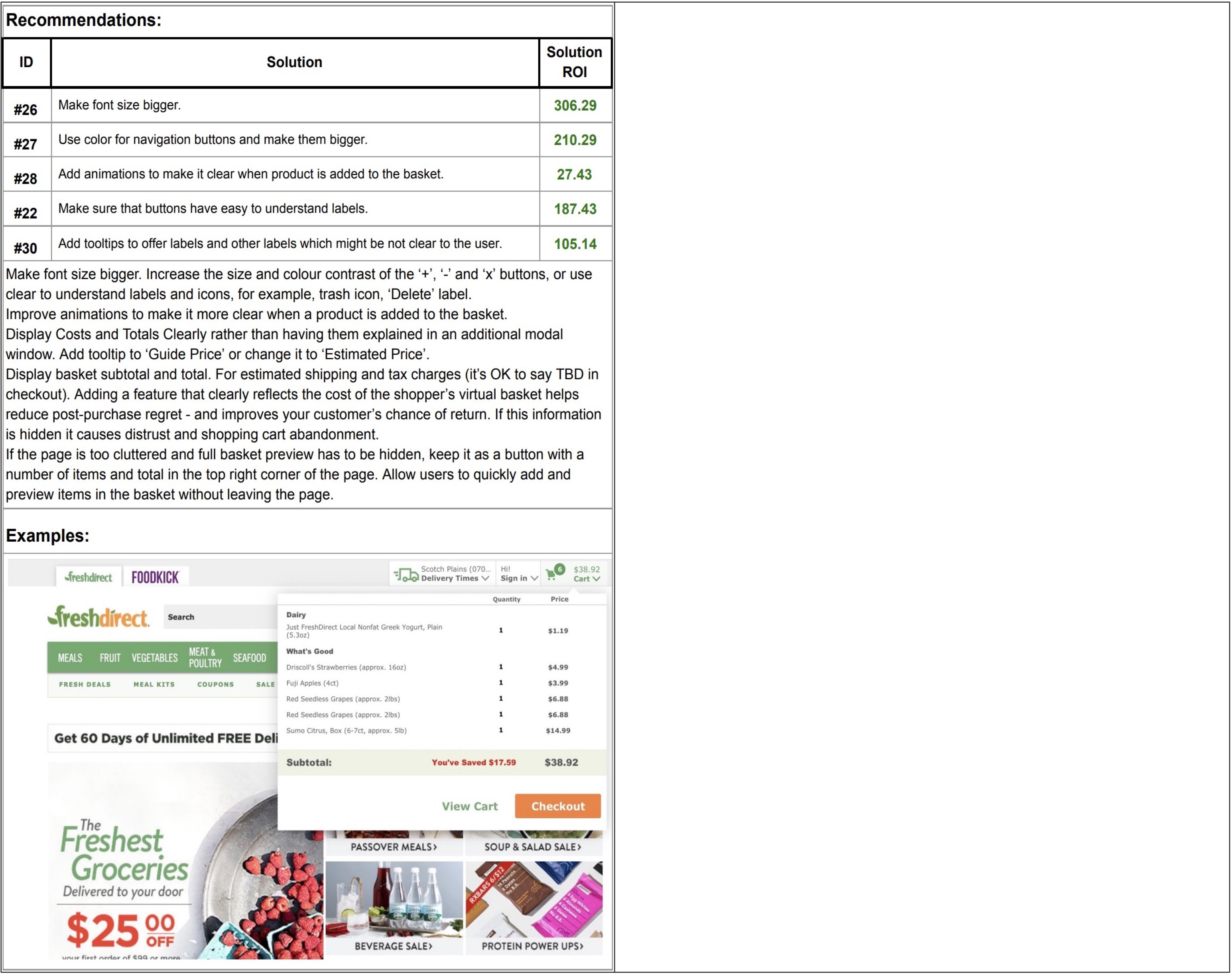
SHOPPING BASKET
SOLUTION:
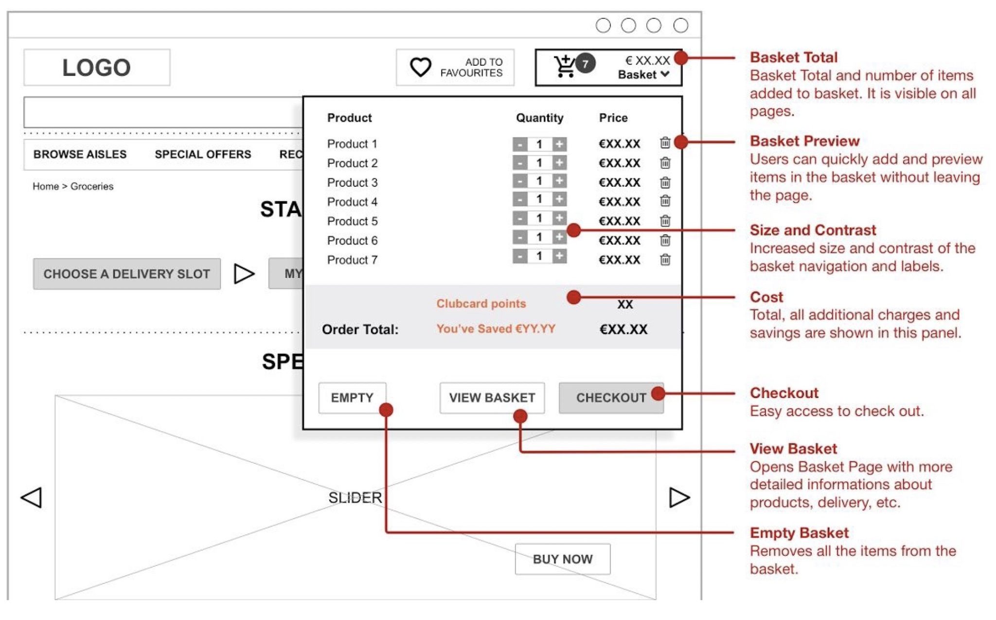
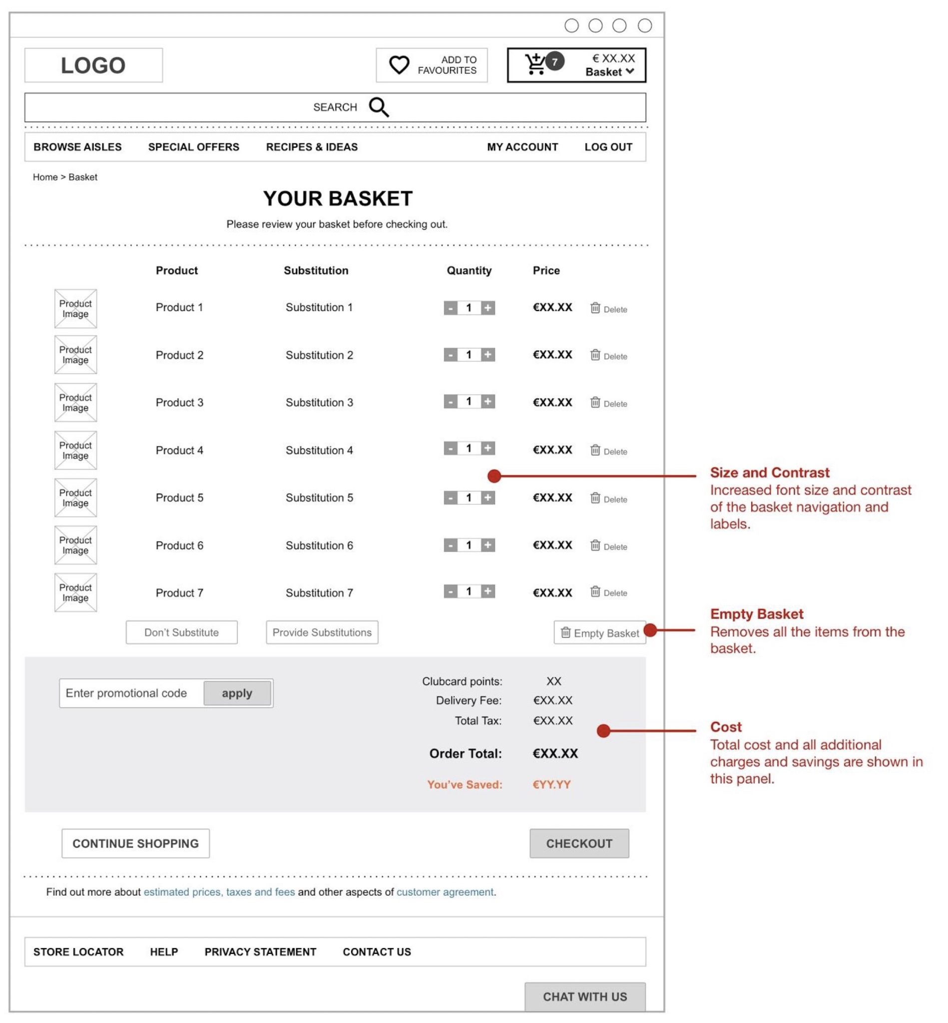
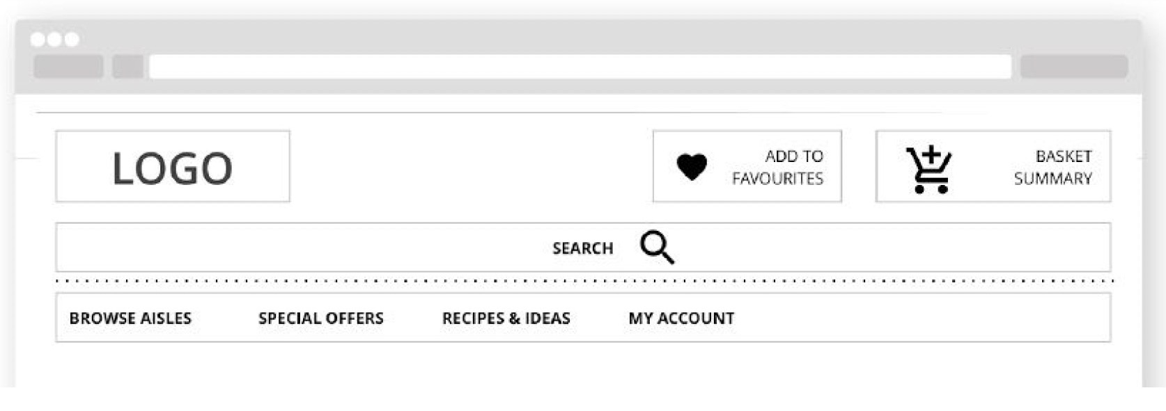
After “hiding” the basket, a basket summary was designed in the top right corner of the page (Philips, 2016). To help users keep track of how much they spend and what they buy without leaving the page, the Mini Basket is proposed (DeGeyter, 2018). It shows up when the user hovers over the icon and it provides an easy access to the full cart.
MULTI-SEARCH WIDGET
SOLUTION:
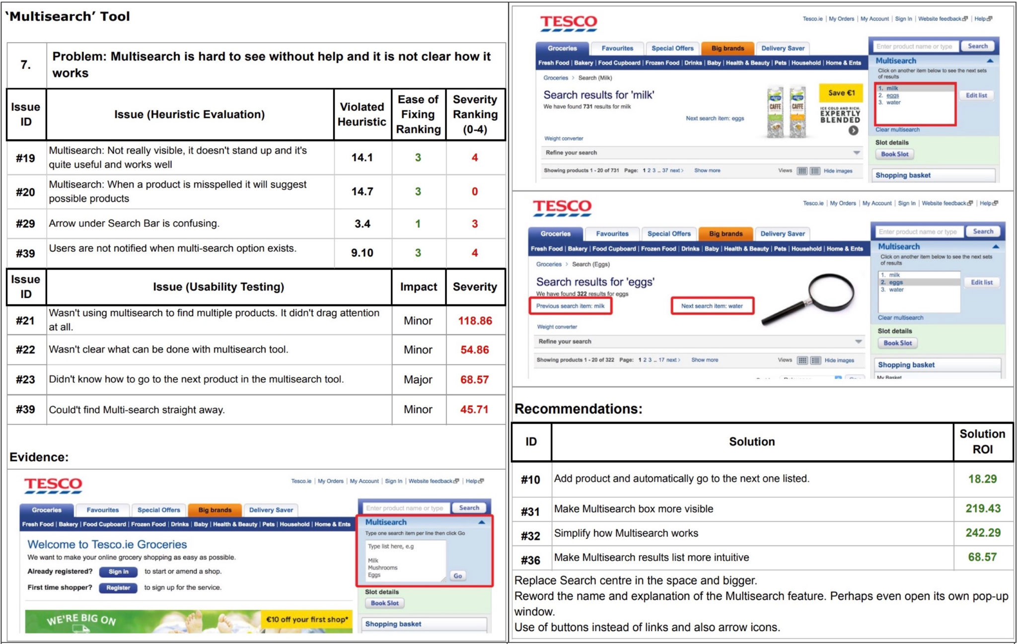
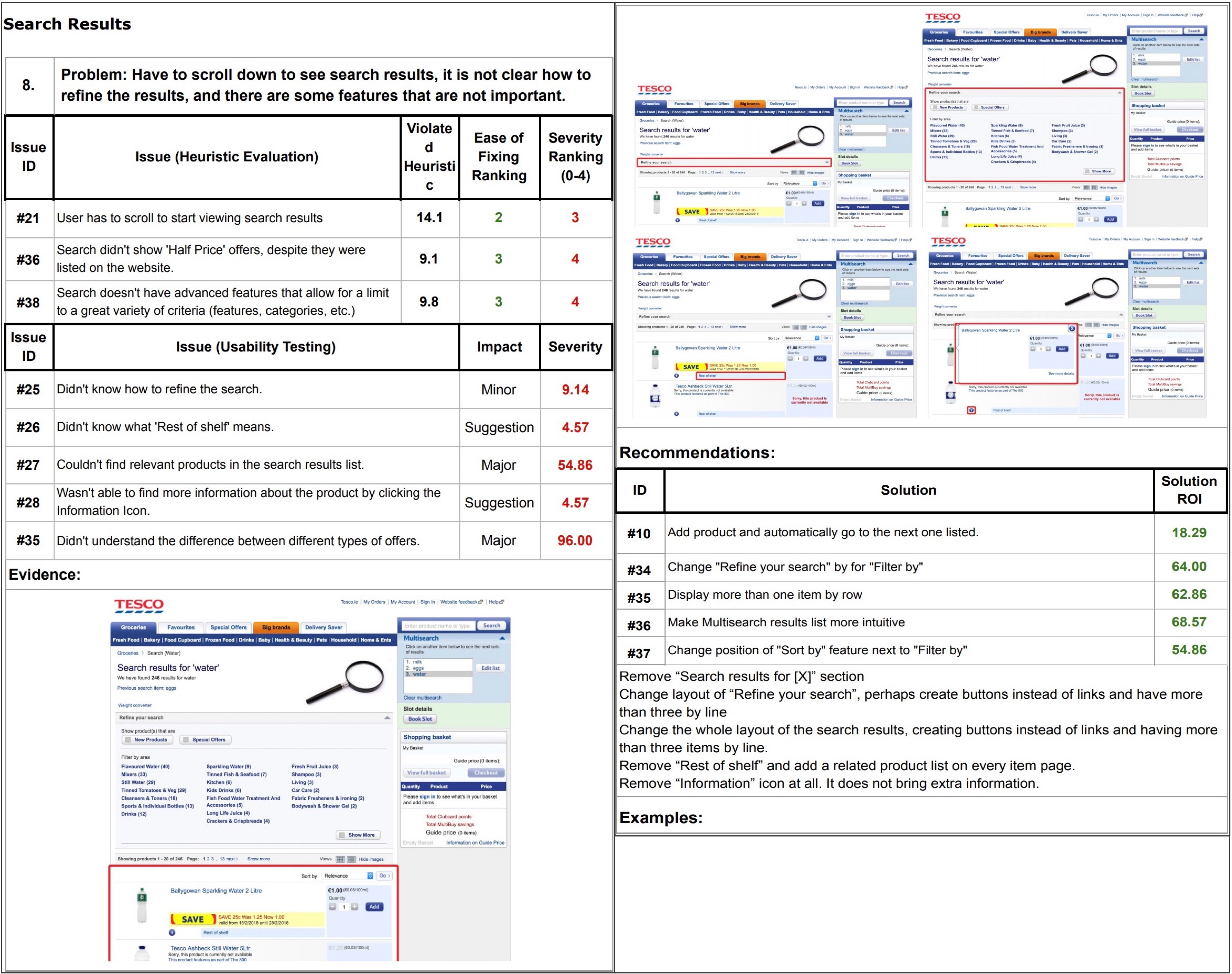
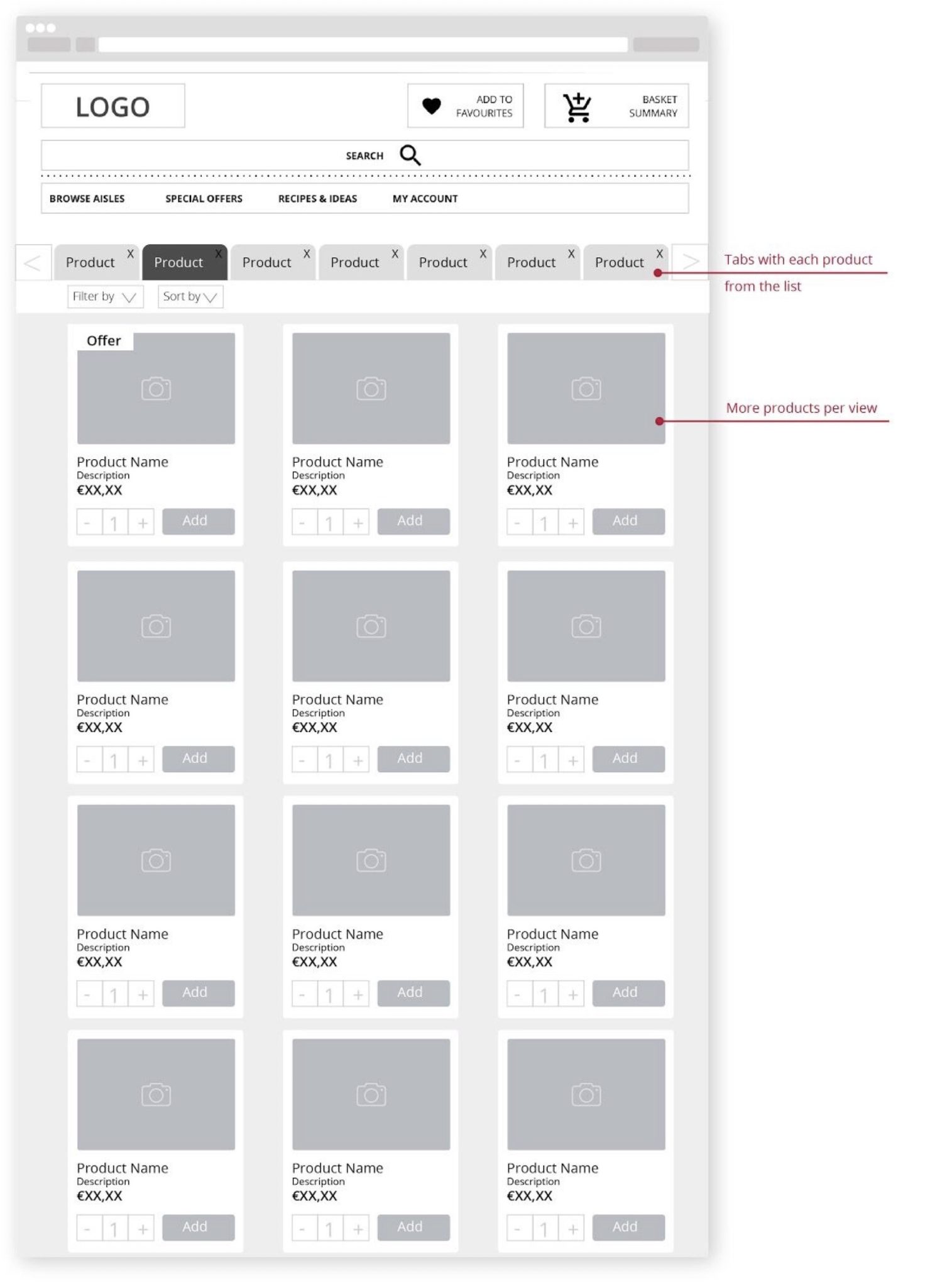
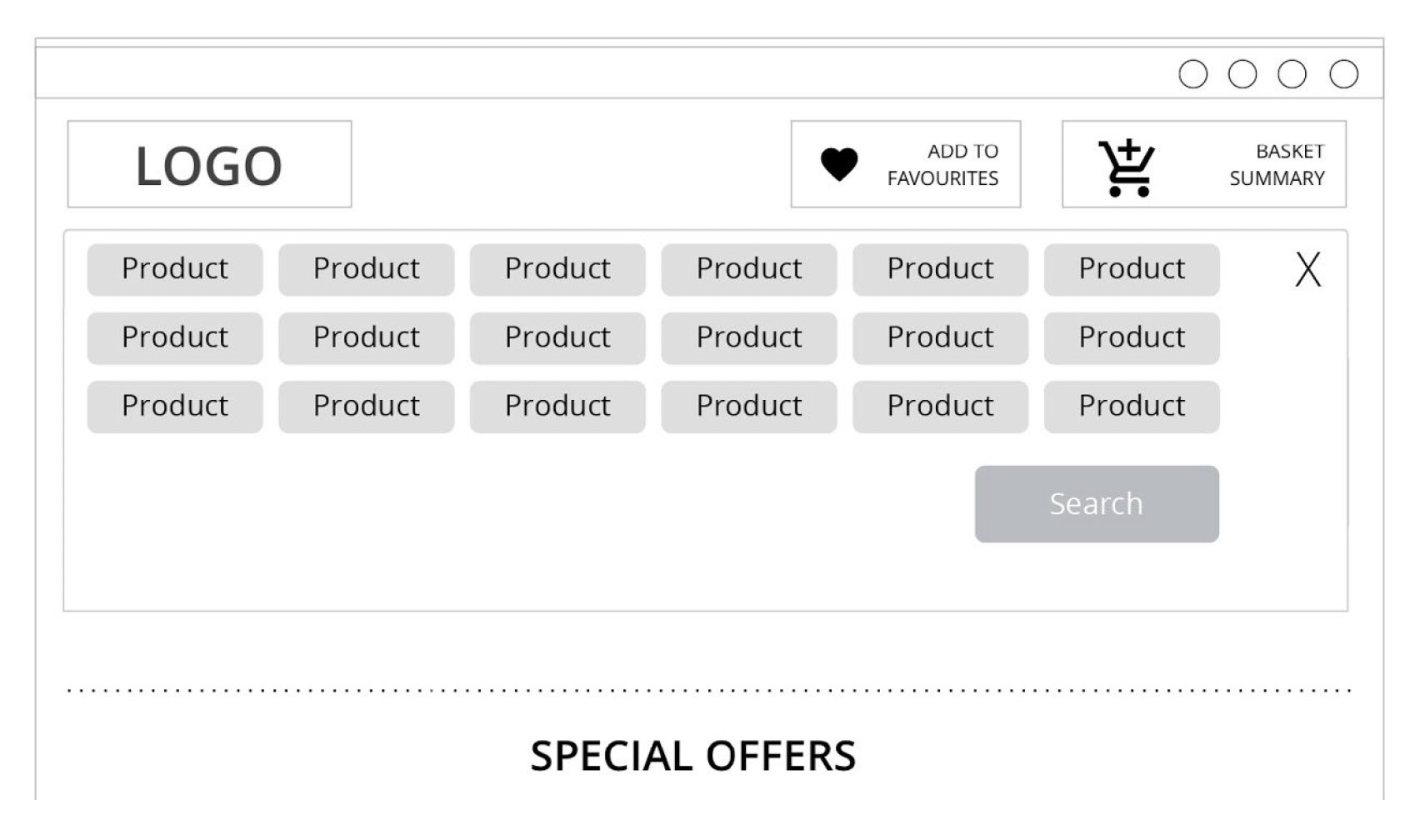
Users were confused when asked to use the “Multisearch”. Reactions such as “I don’t know what Multisearch is”, “I’m hoping I’m not doing anything wrong” or trying the single Search were common. However, as soon as they found out its purpose and how to use it, they seem to think the tool was useful. It was clear, after analysing the test data, that ‘Multisearch’ fails at findability and discoverability (Cardello, 2014). To provide users with instant multiple products search, the Search Box was redesigned. Users can enter comma separated products to find all of them at once. The Search Box was increased in size and moved to the centre of the page. The Next and Previous are replaced by tabs with the listed products/items. Filter By and Browse By are next to each other, under the tab results.
User experience design is an ongoing process.Products and user experiences can constantly evolve.
Reducing paperwork with a new CRM for managing interpreting appointments


