| Company: | Credit Union (Fundamentals in UX Design CA for IADT) |
| Team: | Agnieszka Przygocka, Jill O’Callaghan |
| My Role: | UX Researcher, UX Designer |
| Tools: | Google Docs, Google Forms, Figma, Miro, ScreenFlow |
| Methods: | Heuristic Evaluation, Task Analysis, Usability Testing, Think Aloud, SUS, Paper Prototype |
| Time: | Nov – Dec 2020 |
Usability testing and heuristic evaluation of the final prototype.
We were using two primary procedures to evaluate the final prototype of Counter Program: Think Aloud Method and Heuristic Evaluation.
USABILITY TESTING METHODOLOGY
We planned usability testing with steps listed by Lewis (2006). Our test objectives were to measure two types of data: quantitative – ability to complete tasks successfully and qualitative:
- How the user navigate to complete tasks?
- How easily do users understand what is clickable?
- How users navigate between different sections of the application?
- How well do users understand the symbols and icons? Which ones are problematic and Why?
- Where on the site do users go to find Help?
With Think-Aloud, we were not able to measure the time on tasks, as it takes longer for the users to complete and we would not get the accurate data.
After defining the test objectives, we recruited participants. We have created a screening questionnaire, which if we had more time, would be sent, to the potential participants. We would need to test prototype with at least 10 users, to get the correct data as recommended by Rubin, Chisnell, & Spool (2011). In the end, we recruited two participants.
In the next step, we selected tasks to be evaluated, to match the objectives of testing (Rubin, Chisnell, & Spool, 2011). We worded each task without giving clues on how to complete it (Meyer, 2018). Our goal was to get the users to complete these activities based on their understanding of the application. (See Appendix A6)
ACTIVITIES:
NOTE: Queue Screen Open
1. Please, describe what’s on the screen.
2. Where would you look for help with finding an account?
3. How would you find details of an account 194?
4. You are about to serve your first customer. He used biometrics to enter the queue system. Please load your first customers account details to the screen.
NOTE: Account Details Open
5. Describe what’s on the screen, can you find members address?
6. Your Customer would like to get a loan for €4000. Please Issue a loan to his account.
7. Your Customer changed his mind and wants a loan of €1500 instead. Please correct the amount.
8. Where would you look for help how to correct that transaction?
9. What is the updated balance?
10. Your Customer has two cheques. Please lodge theses cheques into his current account.
In our test plan, we defined success criteria and expected behaviour for each task. (See Appendix A5)
To provide participants with context and help them engage with the interface, together with Jill, we wrote a scenario (Nielsen Norman Group, 2014).
SCENARIO:
Imagine that you are a teller at Credit Union and you use a computer program to handle customer transactions. You are about to welcome your first customer today. The Credit Union system was updated recently, and you are about to use it for the first time.
Tests took place at our homes and took approximately 40 minutes. Desktop computers with Quicktime or ScreenFlow were used to capture screen recordings and conversations.
Each participant was asked to sign the Consent Form. (See Appendix A7)
All the recorded materials we stored on Google Drive and in Rainbow Spreadsheet (Sharon, 2013) which improved our collaboration. (See Appendix A5)
I prepared templates to help us proceed with testing. That included: Test Plan, the Rainbow Spreadsheet to collate all the data, Pre-test Questionnaire, Consent Form, Usability Testing Script for Moderators and List of Tasks for Participants, SUS Questionnaire.
I mapped them with clear instructions in Miro board and shared with Jill.
The participant was asked to complete four activities:
- Pre-test Questionnaire – to learn about the participant’s background and experience
- Think Aloud Test – to measure success rate and get qualitative insights
- Post-test Interview – to learn about the impressions of the website
- SUS Questionnaire to measure satisfaction
In a given time, we were not able to test the final solution with the right number of participants. We also were not able to register all the collected data and they remain in the videos and our notes from the session.
The described methodology could be used to improve our prototype in the future.
We added to the Rainbow spreadsheet data from only one participant. That demonstrates how we would research if given more time. [link: https://docs.google.com/spreadsheets/d/156rVOx98SjvfU47bqQiXIG-tZTgEaAjVqYuKeDk-wAw/edit]
In general, participants did not have problems completing tasks or understanding how to navigate the prototype. The completion rate of the whole test by participant was 80%. When asked to find help with reversing transaction participant was not able to find it.
SUS QUESTIONNAIRE
We asked only one participant to fill in the SUS questionnaire. The score was 90% To measure satisfaction more accurately we would have to send it to more participants and compare the overall score with the industry scores. In general everything, 68% is above average satisfaction level. Again, this is just to demonstrate how we could use SUS for this project.
HEURISTIC EVALUATION
We were using the same guidelines and template to evaluate the proposed solution as we were using to evaluate current system. (See Appendix A8)
We compared summaries of both evaluations
Our prototype adheres to almost all of the heuristics. It is a huge improvement comparing to the existing solution. We were not able to evaluate properly accessibility. As the paper prototype is quite limited, we cannot test keyboard usage or screen readers. Some of the accessibility issues were addressed in the prototype – adding more space between UI components, progressive disclosure, clear labels and icons.
FINAL THOUGHTS
It was a great experience. Jill and me, we have different skills which in case of this project were complementing each other. I usually tend to go too much into details, and I had to make sure to keep things very clear and easy to follow for Jill, who is new to UX design. I was very impressed by how quickly she was able to get her head around all the methods we were using. Her knowledge of the credit unions was invaluable.
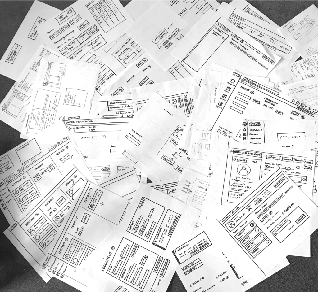
My most important, personal learnings were using accessibility guidelines in heuristic evaluation and paper prototyping. I had tried paper prototyping before and believed that it was a messy and too time-consuming process. Combining it with Figma prototyping seams to be an ideal solution and will use it more in the future. Sketching with sharpers kept me away from jumping into too much detail.
It was quite challenging to fit all of our activities into such a short time frame, and at the end, we had to skip some of the tasks we were originally planning to complete. Our meetings had to be very efficient, and I feel that collaboration and the outcomes of all the calls were very fruitful.
REFERENCES
- Krug, S. (2014). Don’t make me think, revisited : a common sense approach to Web usability. [Berkeley, Calif.] :New Riders,
- Lewis, J. R. (2006). Sample Sizes for Usability Tests: Mostly Math, Not Magic. Interactions, Waits & Measures, 13(6), 29-33. doi:10.1145/1167948.1167973
- Meyer, K. (2018, January 21). Writing Tasks for Quantitative and Qualitative Usability Studies. Retrieved December 5, 2020, from https://www.nngroup.com/articles/test-tasks-quant-qualitative/
- Nielsen, J. (1992). Finding usability problems through heuristic evaluation. Proceedings of the SIGCHI conference on Human factors in computing systems – CHI 92, 373-380. doi:10.1145/142750.142834
- Nielsen, J. (2001, February 18). Success Rate: The Simplest Usability Metric. Retrieved December 2, 2020, from https://www.nngroup.com/articles/success-rate-the-simplest-usability-metric/
- Nielsen, J. (2012, January 16). Thinking Aloud: The #1 Usability Tool. Retrieved December 2, 2020, from https://www.nngroup.com/articles/thinking-aloud-the-1-usability-tool/
- Nielsen Norman Group. (2014, January 12). Task Scenarios for Usability Testing. Retrieved March 27, 2018, from https://www.nngroup.com/articles/task-scenarios-usability-testing
- Rosemberg, C. (2018). Turning Usability Testing Data into Action without Going Insane. Retrieved December 10, 2020, from https://www.toptal.com/designers/usability/turning-usability-testing-data-into-action
- Rubin, J., Chisnell, D., & Spool, J. (2011). Handbook of Usability Testing: How to Plan, Design, and Conduct Effective Tests. Hoboken: John Wiley & Sons, Inc.
- Sharon, T. (2013, April 11). The Rainbow Spreadsheet: A Collaborative Lean UX Research Tool. Retrieved March 15, 2018, from https://www.smashingmagazine.com/2013/04/rainbow-spreadsheet-collaborative-ux-research-tool/
- Brooke, J. (2013). SUS: a retrospective. Journal of usability studies, 8(2), 29-40.
- U.S. Department of Health and Human Services. (n.d.). HHS Web Standards and Usability Guidelines. Retrieved March 13, 2018, from https://guidelines.usability.gov/
Part 1 - Analysis of Existing Solution
Critical appraisal of a digital product in terms of its usability and the user experience it provides based on contemporary usability heuristics and user experience principles.

Part 2 - User Research
Collecting and examining information in order to empathise with users and identify their needs and scenarios of use.

Part 3 - Building Paper Prototype
Designing and constructing a low fidelity prototype of a solution to address a user need by applying principles of design thinking, problem-solving, and critical thinking.


